What's new

C&C please

I like these! The crop fits the subject perfectly, great mix of colors.
 
Overall I like them.

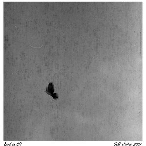
1) I like how the subject enters the frame from the bottom left corner, and I like its lines as it fills the frame. I like the dead space on the right and the fairly artistic bokeh there.

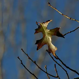
2) I like the diagonal lines here as well. I also like how the red pops against the earth tones, with just enough green to break up the background. I do wish the middle berry had caught more of the light (it looks a little dark next to the left berry), and I wish the right berry was in focus.
 
I don't care for the busy backgrounds stealing attention from the main subjects.
 
I think the backgrounds here work better than a plain background when considering the image as a whole. Yes, it may make the main subject a touch more difficult to isolate (though I think the depth of field in these shots is excellent and more than enough to break out the subjects), but these backgrounds put the subjects in context.

If these were meant to be illustrations in a nature guide, sure, maybe you try to get a less busy background (or even shoot them in studio against a black or white backdrop). But for shots taken in nature (not just shots of nature), I like them.

 
i think there both beautiful. i love the warm colors. they remind me of good times.
 
Nice pics but I agree with KmH that the background is a little distracting on the top one but both images are great for leading the eye into pictures, the background fits well on the berry shot and it doesn't concern me at all but the what does is the out of focus berry, it looks isolated and unloved.
 

Create an account or login to comment

You must be a member in order to leave a comment

Create account

Create an account on our community. It's easy!

Log in

Already have an account? Log in here.

Back
Top Bottom