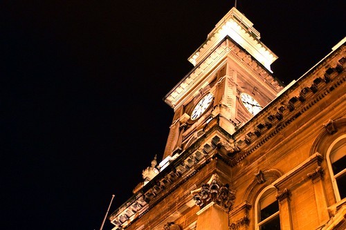
I totally agree with the mast up top. If getting the whole thing throws off the composition you are going for, definately clone out the bit that makes it look incomplete.
The image is nice, but nothing out of the ordinary for me. Things I would do differently would be a slightly less tilted angle, move back a bit more to get more of the clock face in the image. Also trying to angle in the second clock face on the right, as currently it's cut. This would also help get a bit more of those bottoms windows on the lower right hand side in the frame, which like the cut off mast, make it look a little unfinished. You might be able to pull in the second gargoyly thing above the door... you have one on the right, none on the left.
The image overall screams of lines and symetry and the items I wrote above go against that.
I dont mind the negative space, it works.
I'm being pretty nitpicky about things, but hey, you asked
")
Technically, the image looks nice and sharp. Curious how the sharpness holds up at much bigger size (and no, dont post a bigger size, just saying that small images can be misleading). The white balance could use an adjustment more to the blue end, although the current version does remind me more of a street light style scene.
Welp, just random garbles from my brain. Hope it helps

")


![[No title]](/data/xfmg/thumbnail/37/37602-1ef8dbb1c2d0e4ff347ee65d328c3603.jpg?1734170730)


