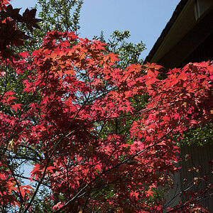
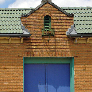
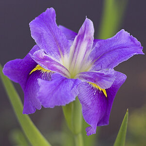
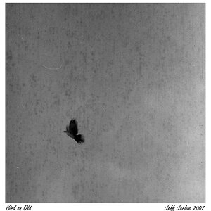
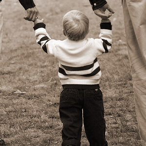
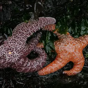
The first two look a little over-saturated, although I like the symmetry in the second one.
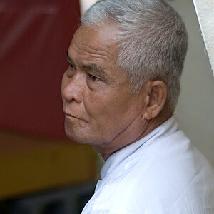
The third one is not too bad. I would crop out what appears to be another waterfalls in the upper left of the image - it is too distracting. As far as the rest of it goes, it looks a little dark - perhaps brighten up the rocks a bit to try and bring out some of their detail, if they have any. Another suggestion, is to try a polarizer when shooting water, as it can be used to take out the glare or glistening off the water.
The only other thing is a request - please number your images when you post them as it makes it a lot easier for a reviewer to refer to them.
Cheers,
WesternGuy