Thanks to everyone for the valuable feedback...I am just starting out and still really trying to understand white balance and color and well, really, all of it

Absolutely the most difficult thing is to be objective about one's own pictures - and that's key to making edits.
I suggest this.
First, allow a day or so between your first viewing and the final editing, that allows that first rush of enthusiasm to fade.
Now assuming the picture does have the general impact you want, break down your self-critique into small measurable peeks, where you look at specific items and decide whether items that seem 'wrong' should be or can be changed.
Are there bright areas of light or color that draw your eye from the real object of interest?
Are there one or more obvious centers of visual interest where your eye can settle?
Is(are) the center(s) of interest - the main subject(s) - well placed within the frame and does the placement relate well to the rest of the content so that any viewer's eye is drawn to, rather than away?
Is there excess space that pulls the eye away and drains any tension or drama from the picture?
Is there space that gives some weight to an important part of an image?
Is there enough space so that nothing feels cramped or cut off?
If the subject is a person or a face and his/her placement in the frame is asymmetric, does the asymmetry make sense to the eye?
Are there geometric issues? e.g. are the horizontals and vertical correct, and is that important?
Is the skin color 'natural' to the subject?
Are there little off-tints in the skin? (look at the sides of the nose and under the chin where these lurk.)
Is there a bluish tint to the skin or the whites of the eyes? (Even with a custom white balance, this is all too common in portraits taken outdoors. Try adding a warming photo filter and see how this looks.)
Is the color or tonality appropriate for the content? Saturation or lack of it? Correct hues, white balance?
Does the color make the point that you want?
Is the sharpness or lack of sharpness appropriate?
Is everything that should be in focus and sharp, actually so?
In the reverse, is there so much depth of field, so much in focus that attention is drawn away from the real object of interest?
Are there individual small defects -points of motion, dirt on the lens/sensor, out-of-focus spots that hurt the image, unduly bright areas that draw the eye?
This will quickly become unscripted and automatic.
added
Nothing is wrong
per se if it creates the impression that you want to make.
Something is wrong if it gets between the viewer and her/his appreciation of the image.





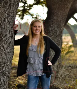
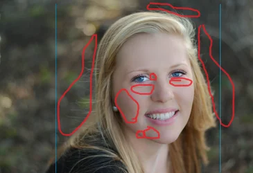

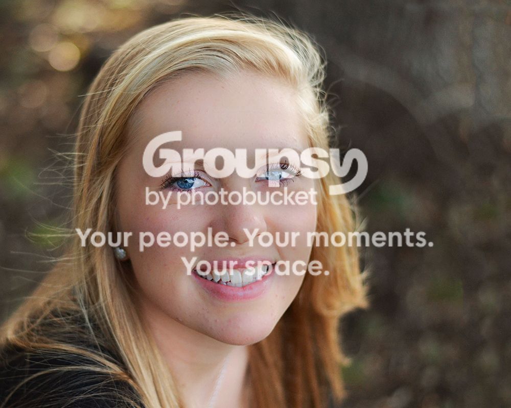





![[No title]](/data/xfmg/thumbnail/40/40288-4d5d7a8aa74ddfceb5fb82062d9b21be.jpg?1734174702)

![[No title]](/data/xfmg/thumbnail/37/37536-3578b4f283f738d862be62d896fa52d5.jpg?1734170692)

![[No title]](/data/xfmg/thumbnail/37/37540-73002ccb910b97978bc38658622a34d3.jpg?1734170695)