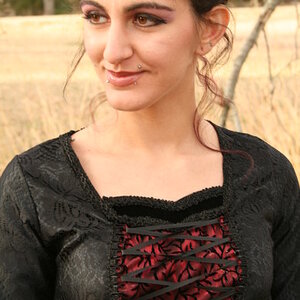
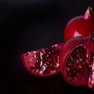
Hi Lisa! I'm a newbie too, so take it for what it's worth!

1st one: I like the pose, it's cute, but the image seems out of focus or bad quality (noisy, maybe?). The foliage on the foreground is a bit distracting and it could have been a good help to give the guy a little photoshop cleaning on the skin.
2nd: nice pose again, cute model. I'd have brought more light and contrast, maybe. The wood behind her is also a bit distracting because it blends with her clothes and hat, it makes me wonder where her head stops rather than look at this beautiful face...
3rd: a bit boring with the horizon line right in the middle, and lacks a point of interest where your eyes can "land", IYKWIM.
And overall all of them would need a little sharpening.
Just my thoughts, there's room for improvement of course but those are definitely much better than my first shots. *shake head in shame remembering those*