What's new

[C&C] Results of my first 'shoot' (photo heavy)

jdsfighter

No longer a newbie, moving up!
Joined
Jun 2, 2012
Messages
266
Reaction score
29
Location
Owasso, OK
Can others edit my Photos
Photos OK to edit
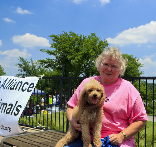
I volunteered at a local animal rescue event with my company, Best Buy, and we were in charge of taking photos of the new adoptees. We took a lot while we were there, and while I was the only one there who had ever laid hands on a DSLR, I believe it turned out decent.

We snapped over 500 photos, but here are some of the better ones.

I apologize for the massive list of pictures, but if you could pick out a couple that stand out as either nice or horrible, and give a few tips accordingly, it would be appreciated. Thanks!

Original thread: http://www.thephotoforum.com/forum/digital-discussion-q/287231-need-tips-my-first-shoot.html

P
hotos:

#1. A New Companion by Jdsfighter, on Flickr
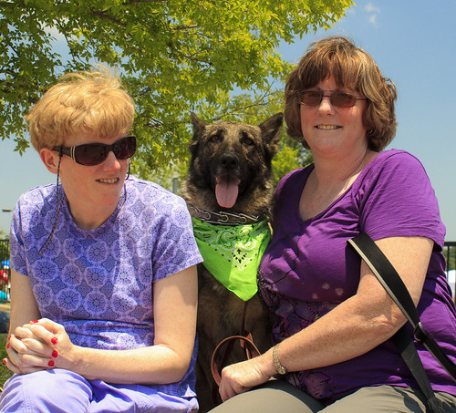

#2. Happiness in all Forms by Jdsfighter, on Flickr
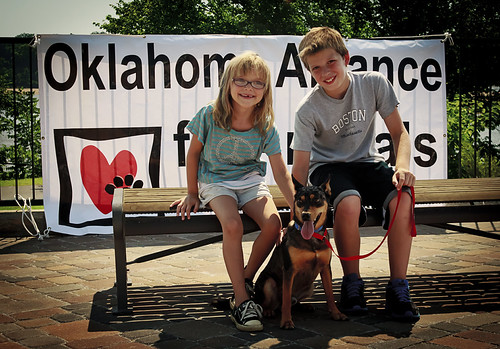

#3. A New Face in the Family by Jdsfighter, on Flickr
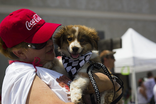

#4. Youthful Innocence by Jdsfighter, on Flickr
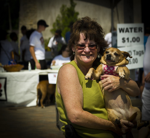

#5. Portly and Proud by Jdsfighter, on Flickr
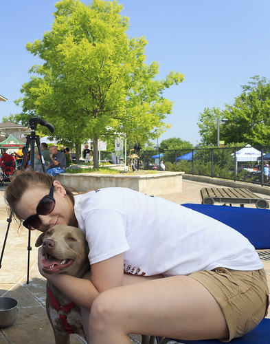

#6. Best Friends by Jdsfighter, on Flickr
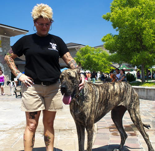

#7. But it's not a Horse by Jdsfighter, on Flickr
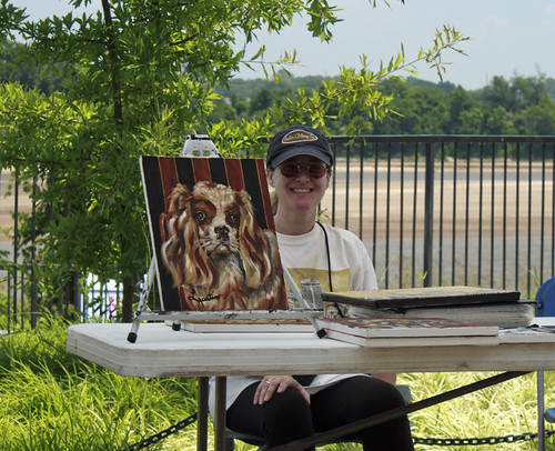

#8. Strokes of Love by Jdsfighter, on Flickr
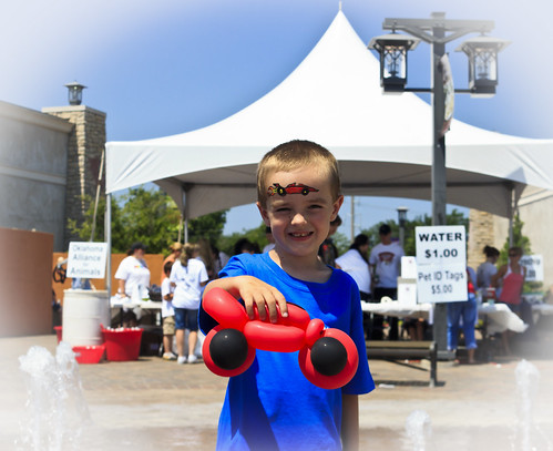

#9. A New Car by Jdsfighter, on Flickr
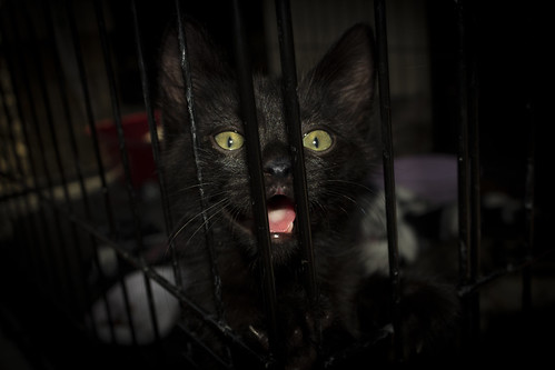

#10. A Longing Unknown by Jdsfighter, on Flickr
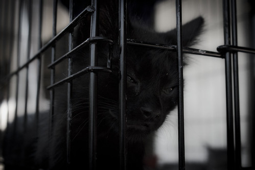

#11. Day of Sorrow by Jdsfighter, on Flickr
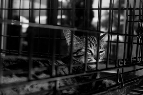

#12. Together We Stand by Jdsfighter, on Flickr
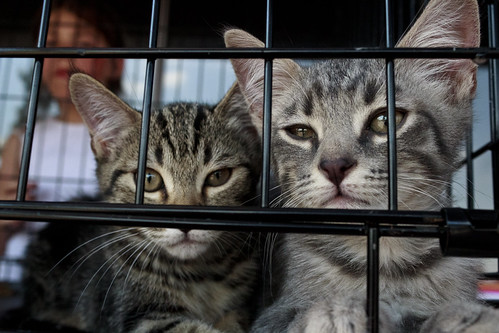

#13. A Dream Awaited by Jdsfighter, on Flickr
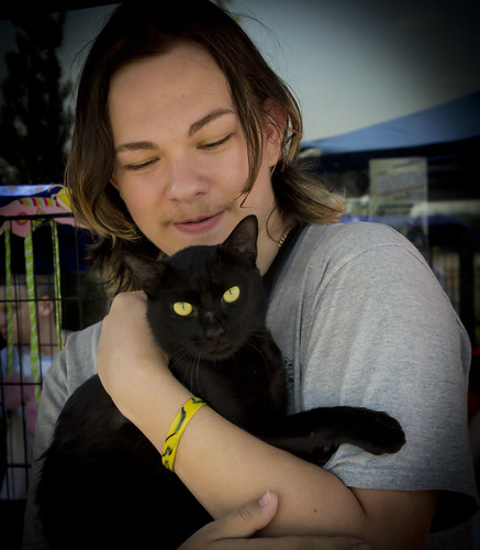

#14. The Perfect Friend by Jdsfighter, on Flickr
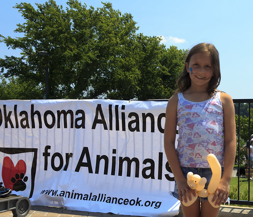

#15. Supporting Love by Jdsfighter, on Flickr
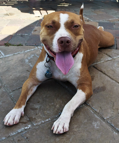

#16. The Face of Love by Jdsfighter, on Flickr
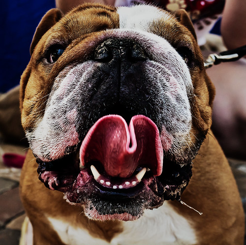

#17. A Happy Friend by Jdsfighter, on Flickr
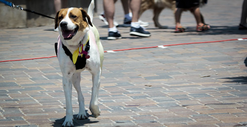

#18. Led Astray by Jdsfighter, on Flickr
 
Last edited:
Next time, please number your photos so we can easily reference them.

Most of these suffer from poor lighting in the faces (bright mid-day sun can be brutal) and weak composition. I like the juxtaposition of the owner's hair/tattoos and the dog's coloration/patterns in #7. The tongue in #17 is funny. What's with the vignetting? It doesn't work, imo.
 
Next time, please number your photos so we can easily reference them.

Most of these suffer from poor lighting in the faces (bright mid-day sun can be brutal) and weak composition. I like the juxtaposition of the owner's hair/tattoos and the dog's coloration/patterns in #7. The tongue in #17 is funny. What's with the vignetting? It doesn't work, imo.

Numbered.

Also, I did my best to compose the photos on the fly, as the area was insanely crowded. It was also my first time working with people or animals for that matter.
 
Wtf happened with #6? Do you not plan what you're going to shoot? You have a tripod in the background.

-ken Turner
 
The thing that stands out to me is that this is supposed to be about the animals. As I was scrolling down initially...had I not known...I would not have known it was about animals. Hope that makes sense. lol.

In short...showcase your subject more...like you did in some of your latter photos.

16 and 17 are cute and 4 as well

won't really comment on all of em, 'cause there's just too many. lol.

a general thing, which you probly know....it work on your comp more. Lots of framing changes and crops etc in this set is what I would work on. Naturally the same thing from your other thread about exposure.

Looks, for the most part, like you were just a tourist walking around with a point and shoot snapping pics, not a photographer trying to showcase an event.

I think you scored on a few of them though....I'm guessing you probly had a blast. Learning is fun.
 
Wtf happened with #6? Do you not plan what you're going to shoot? You have a tripod in the background.

-ken Turner

So where is the "dislike" button. I wonder if you could be any less helpful?
 
Wtf happened with #6? Do you not plan what you're going to shoot? You have a tripod in the background.

-ken Turner

It was four other employees and myself snapping photos. So for most of the day is was very difficult to get any type of organization. In #6, I was dialing in my settings. So, no. I didn't plan this shot at all.
 
Just the first thoughts that come to my head as I look at these:

1. Square format not working for me, especially with half a sign and too much sky putting the subject in a quarter of the frame. Paws cut off (basic no-no is cutting off limbs at joints). Harsh light, could use fill flash or reflector.

2. Same as above except for the cut paws. Seems a little crowded though in the composition, rather than too much room in 1.

3. Fill light, lose the vignette.

4. Fill light, hat/head clipped while including dead space on right.

5. Harsh shadow, fill light, lose the vignette.

6. Subject in bottom half, tree unnecessary & doesn't add to composition, tripod growing out of subject head.

7. Fill flash, cut paws and feet at ankles.

8. Too much space around subject, crop tighter, lose view under table.

9. Fill flash, lose the vignette.

10. Too dark, lose the vignette, which makes it worse.

11. Same as above, but worse on the darkness.

12. Some interest here, cat in cage garners sympathy, like the B&W treatment.

13. clipped ear, but cats in cage garner some sympathy, which may be appropriate for the shoot.

14. Too dark, lose the vignette.

15. This is way to close to Pedo-Bear material. Without the baloon bear with the phallic tail, still needs fill flash.

16. Not bad, except for the harsh shadow, bright light on the ground that pulls attention from the subject.

17. Interesting, if a bit over the top on the PS.

18. Needs more head and foot room, less room on the right in the composition. The subject is a vertical, squeezed tightly into a horizontal comp, and can't see a reason for it. People feet and cord don't add interest to account for it.
 
No soothing words.... i really liked most of these images....they look very spontaneous to me...and i really feel the rapport between the master and they pet.... i felt sorry for those caged kittens.... :thumbsup:
 
Just the first thoughts that come to my head as I look at these:

1. Square format not working for me, especially with half a sign and too much sky putting the subject in a quarter of the frame. Paws cut off (basic no-no is cutting off limbs at joints). Harsh light, could use fill flash or reflector.

2. Same as above except for the cut paws. Seems a little crowded though in the composition, rather than too much room in 1.

3. Fill light, lose the vignette.

4. Fill light, hat/head clipped while including dead space on right.

5. Harsh shadow, fill light, lose the vignette.

6. Subject in bottom half, tree unnecessary & doesn't add to composition, tripod growing out of subject head.

7. Fill flash, cut paws and feet at ankles.

8. Too much space around subject, crop tighter, lose view under table.

9. Fill flash, lose the vignette.

10. Too dark, lose the vignette, which makes it worse.

11. Same as above, but worse on the darkness.

12. Some interest here, cat in cage garners sympathy, like the B&W treatment.

13. clipped ear, but cats in cage garner some sympathy, which may be appropriate for the shoot.

14. Too dark, lose the vignette.

15. This is way to close to Pedo-Bear material. Without the baloon bear with the phallic tail, still needs fill flash.

16. Not bad, except for the harsh shadow, bright light on the ground that pulls attention from the subject.

17. Interesting, if a bit over the top on the PS.

18. Needs more head and foot room, less room on the right in the composition. The subject is a vertical, squeezed tightly into a horizontal comp, and can't see a reason for it. People feet and cord don't add interest to account for it.

So if I clean up the set, and ask for a rating out of 10 XD where would I be? 0 being completely horrible. 10 being flawless. Am I at a 3-5?
 
Just the first thoughts that come to my head as I look at these:

1. Square format not working for me, especially with half a sign and too much sky putting the subject in a quarter of the frame. Paws cut off (basic no-no is cutting off limbs at joints). Harsh light, could use fill flash or reflector.

2. Same as above except for the cut paws. Seems a little crowded though in the composition, rather than too much room in 1.

3. Fill light, lose the vignette.

4. Fill light, hat/head clipped while including dead space on right.

5. Harsh shadow, fill light, lose the vignette.

6. Subject in bottom half, tree unnecessary & doesn't add to composition, tripod growing out of subject head.

7. Fill flash, cut paws and feet at ankles.

8. Too much space around subject, crop tighter, lose view under table.

9. Fill flash, lose the vignette.

10. Too dark, lose the vignette, which makes it worse.

11. Same as above, but worse on the darkness.

12. Some interest here, cat in cage garners sympathy, like the B&W treatment.

13. clipped ear, but cats in cage garner some sympathy, which may be appropriate for the shoot.

14. Too dark, lose the vignette.

15. This is way to close to Pedo-Bear material. Without the baloon bear with the phallic tail, still needs fill flash.

16. Not bad, except for the harsh shadow, bright light on the ground that pulls attention from the subject.

17. Interesting, if a bit over the top on the PS.

18. Needs more head and foot room, less room on the right in the composition. The subject is a vertical, squeezed tightly into a horizontal comp, and can't see a reason for it. People feet and cord don't add interest to account for it.

So if I clean up the set, and ask for a rating out of 10 XD where would I be? 0 being completely horrible. 10 being flawless. Am I at a 3-5?
Sorry, but I can't give you a number from 0 to 10...

In my opinion, these are snapshots, nothing more - they don't even rate on a scale of what I would consider "photography" which is much more controlled and purposeful. Don't mean to be harsh-sounding, but there it is, in a nutshell. These are a long way from minimal standards I would require for publication or sales, and especially not for promotional or commercial purposes.

That could change somewhat on cleanup, I suppose, but I wouldn't honestly count on it. I guess it depends on how well you're able to clean them up. Aside from the current crops and vignettes that you should be able to correct fairly easily, you have lighting/shadow issues and clipped limbs, paws, ears or what have you that will likely prove to be much more difficult, from my experience with PP, which is fairly extensive.

If nothing else though, it's good practice to give it a shot, especially if these mean something to you or are going to be used for commercial or promotional use by you or the folks you work for whether you like it or not, since it appears to be a work for hire situation.
 
Just the first thoughts that come to my head as I look at these:

1. Square format not working for me, especially with half a sign and too much sky putting the subject in a quarter of the frame. Paws cut off (basic no-no is cutting off limbs at joints). Harsh light, could use fill flash or reflector.

2. Same as above except for the cut paws. Seems a little crowded though in the composition, rather than too much room in 1.

3. Fill light, lose the vignette.

4. Fill light, hat/head clipped while including dead space on right.

5. Harsh shadow, fill light, lose the vignette.

6. Subject in bottom half, tree unnecessary & doesn't add to composition, tripod growing out of subject head.

7. Fill flash, cut paws and feet at ankles.

8. Too much space around subject, crop tighter, lose view under table.

9. Fill flash, lose the vignette.

10. Too dark, lose the vignette, which makes it worse.

11. Same as above, but worse on the darkness.

12. Some interest here, cat in cage garners sympathy, like the B&W treatment.

13. clipped ear, but cats in cage garner some sympathy, which may be appropriate for the shoot.

14. Too dark, lose the vignette.

15. This is way to close to Pedo-Bear material. Without the baloon bear with the phallic tail, still needs fill flash.

16. Not bad, except for the harsh shadow, bright light on the ground that pulls attention from the subject.

17. Interesting, if a bit over the top on the PS.

18. Needs more head and foot room, less room on the right in the composition. The subject is a vertical, squeezed tightly into a horizontal comp, and can't see a reason for it. People feet and cord don't add interest to account for it.

So if I clean up the set, and ask for a rating out of 10 XD where would I be? 0 being completely horrible. 10 being flawless. Am I at a 3-5?
Sorry, but I can't give you a number from 0 to 10...

In my opinion, these are snapshots, nothing more - they don't even rate on a scale of what I would consider "photography" which is much more controlled and purposeful. Don't mean to be harsh-sounding, but there it is, in a nutshell. These are a long way from minimal standards I would require for publication or sales, and especially not for promotional or commercial purposes.

That could change somewhat on cleanup, I suppose, but I wouldn't honestly count on it. I guess it depends on how well you're able to clean them up. Aside from the current crops and vignettes that you should be able to correct fairly easily, you have lighting/shadow issues and clipped limbs, paws, ears or what have you that will likely prove to be much more difficult, from my experience with PP, which is fairly extensive.

If nothing else though, it's good practice to give it a shot, especially if these mean something to you or are going to be used for commercial or promotional use by you or the folks you work for whether you like it or not, since it appears to be a work for hire situation.

Thank you, I appreciate the honest answer. I'm very far from doing commercial photography. I've said it in previous threads, but I do have a fairly decent artistic background, however, my only equipment thus far is a T3i and a 18-55mm kit lens. I will be improving my collection, but for now I just want practive. I have several friends that want me to photograph them, so I'm considering getting some practice with them.

It was incredibly bright on location, and it was midday, and honestly with booths so close together, it was difficult to get any shots at all. But I had a lot of fun, and I think some basic practice for posing and photographing people.
 

Create an account or login to comment

You must be a member in order to leave a comment

Create account

Create an account on our community. It's easy!

Log in

Already have an account? Log in here.

New Topics

Back
Top Bottom