fjrabon
Been spending a lot of time on here!
- Joined
- Nov 3, 2011
- Messages
- 3,644
- Reaction score
- 757
- Location
- Atlanta, GA, USA
- Can others edit my Photos
- Photos OK to edit
I know I've been hammering you guys on the sunrise C&C's lately, but I guess it's kind of evolved into a theme for me, as overdone as it is. Though I guess there are worse themes out there to be stuck on than sunrises. I swear I'll shoot something different sometime this week. 
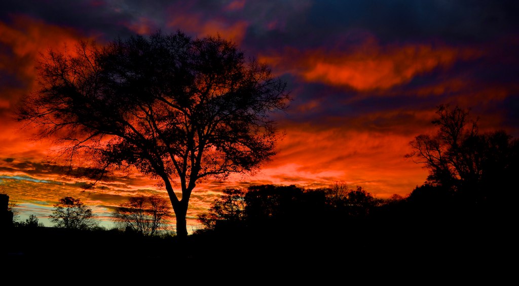
1. pre-sunrise
DSC_0025 by franklinrabon, on Flickr
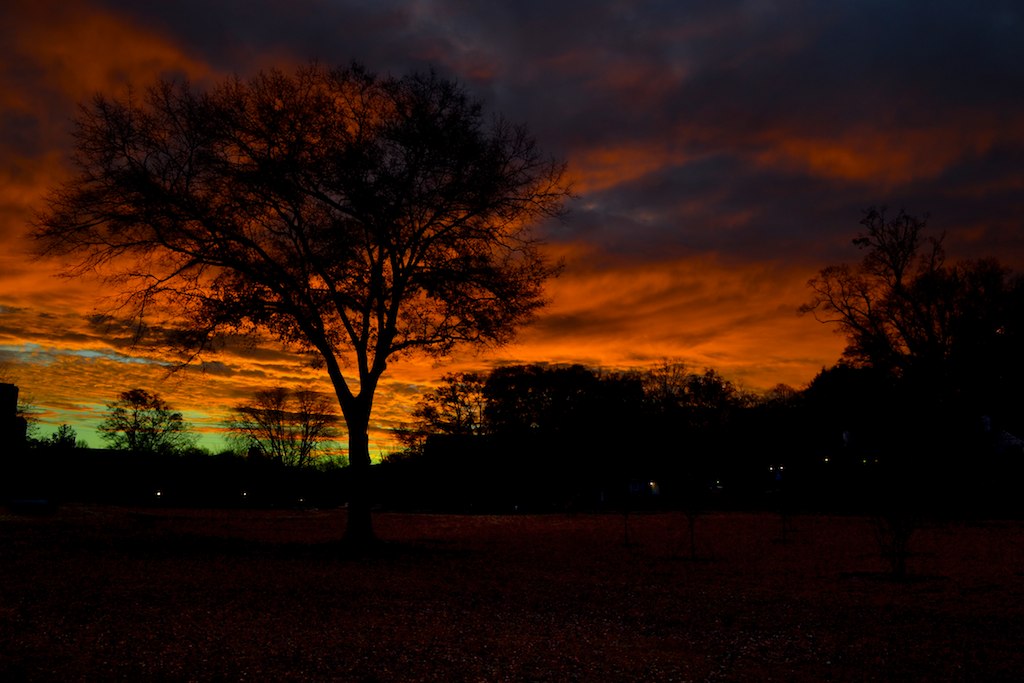
2. right at sunrise
DSC_0044 by franklinrabon, on Flickr
The only difference between the two is 15 minutes, one click of exposure compensation, and the 2nd was cropped to remove some of the dead black space at the bottom. First image, pretty much all the light was reflected off the sky, hence the red glow to everything. 2nd image you get a mix of direct sunlight and reflected sunlight. I added a bit of contrast, and a really small amount of saturation to them, but I added the same exact amount to both.
Both were shot at 18mm with the Nikon intro level kit lens (all the talk about the kit lens the other day made me want to dust it off and snap a few with it). Both shots used a CPL filter as well.
Any comments and critiques on any aspects of either image are more than welcome.
1. pre-sunrise
DSC_0025 by franklinrabon, on Flickr
2. right at sunrise
DSC_0044 by franklinrabon, on Flickr
The only difference between the two is 15 minutes, one click of exposure compensation, and the 2nd was cropped to remove some of the dead black space at the bottom. First image, pretty much all the light was reflected off the sky, hence the red glow to everything. 2nd image you get a mix of direct sunlight and reflected sunlight. I added a bit of contrast, and a really small amount of saturation to them, but I added the same exact amount to both.
Both were shot at 18mm with the Nikon intro level kit lens (all the talk about the kit lens the other day made me want to dust it off and snap a few with it). Both shots used a CPL filter as well.
Any comments and critiques on any aspects of either image are more than welcome.