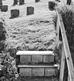
I feel there are too many competing elements: lamp, tree, steps, buildings, etc. Even the blown sky is drawing my attention. I'd try a crop emphasizing the steps leading to the graves. Something like this:
Haha, laughed at that. In my opinion the second one looks a bit too plain and the first one could be slightly angled maybe? Doesn't matter how much stuff you got going on there, but what matters is position, position, position.





 Do settings need to be adjusted when using an adapted lens?


![[No title]](/data/xfmg/thumbnail/35/35263-86f580cf5d28d23109a45984030a79ad.jpg?1734166920)



![[No title]](/data/xfmg/thumbnail/33/33026-d1cc9c60c2164adb92d7186eedb0673d.jpg?1734163026)