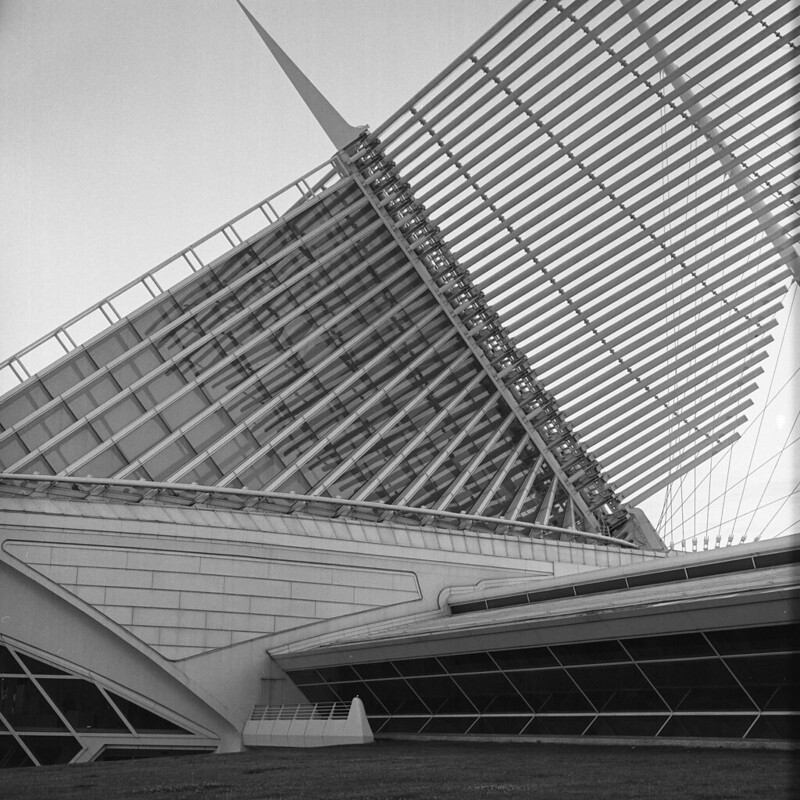
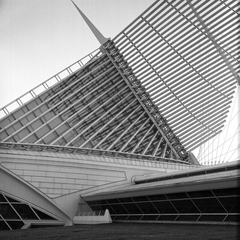
This is pretty similar to another image I posted, but taken a bit further back and done on film (medium format). How did I do? How can I improve? Thanks, guys.
Thanks for the feedback, guys! A tried rotating it, but the front (the bow shaped part) looked a bit too tilted, so this is about the best compromise in terms of rotation. Contrast, however, makes a HUGE difference. Here's what I mean:
I like the second one too MC...it has more separation from the background, not that the first one is not good enough, just that this one is more clearer and more nicer to the eyes...Good work.






![[No title]](/data/xfmg/thumbnail/37/37606-3c9ffb5906173fa2aa489341967e1468.jpg?1734170733)
![[No title]](/data/xfmg/thumbnail/31/31757-4f5257d19be4e34c6bdcbd2519380d53.jpg?1734160480)
![[No title]](/data/xfmg/thumbnail/39/39478-0db485f4efaffd784bfa5cc75ff7502f.jpg?1734173575)
![[No title]](/data/xfmg/thumbnail/31/31703-20d81c98f43a64450882572a96c8f266.jpg?1734160374)
![[No title]](/data/xfmg/thumbnail/31/31704-42c2fcbcc4b6ba8c2c5ae54202cad6ec.jpg?1734160376)
![[No title]](/data/xfmg/thumbnail/31/31702-59b5519e3c9a12b85ca69439a27f5253.jpg?1734160371)