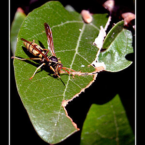
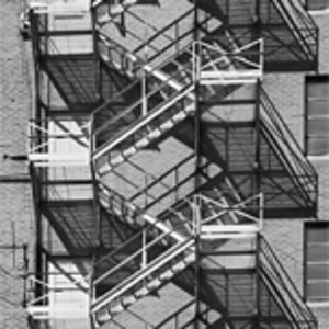
I think the composition is fine. Gripes with the subject matter are kind of irrelevant; What interests one person, another might not care about.
#1 - Could maybe get cropped tighter to show the spiderweb strands a bit more clearly.
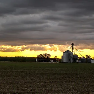
#2 - Wouldn't change much here. Do keep in mind though (I picked up on this rule from another member here) that dark recedes and light advances. A bright background can be distracting when the subject is dark. In this case the eyes can be drawn away from the wood and up into the bright sky, not what you want probably. (Also congratulations on the award!)
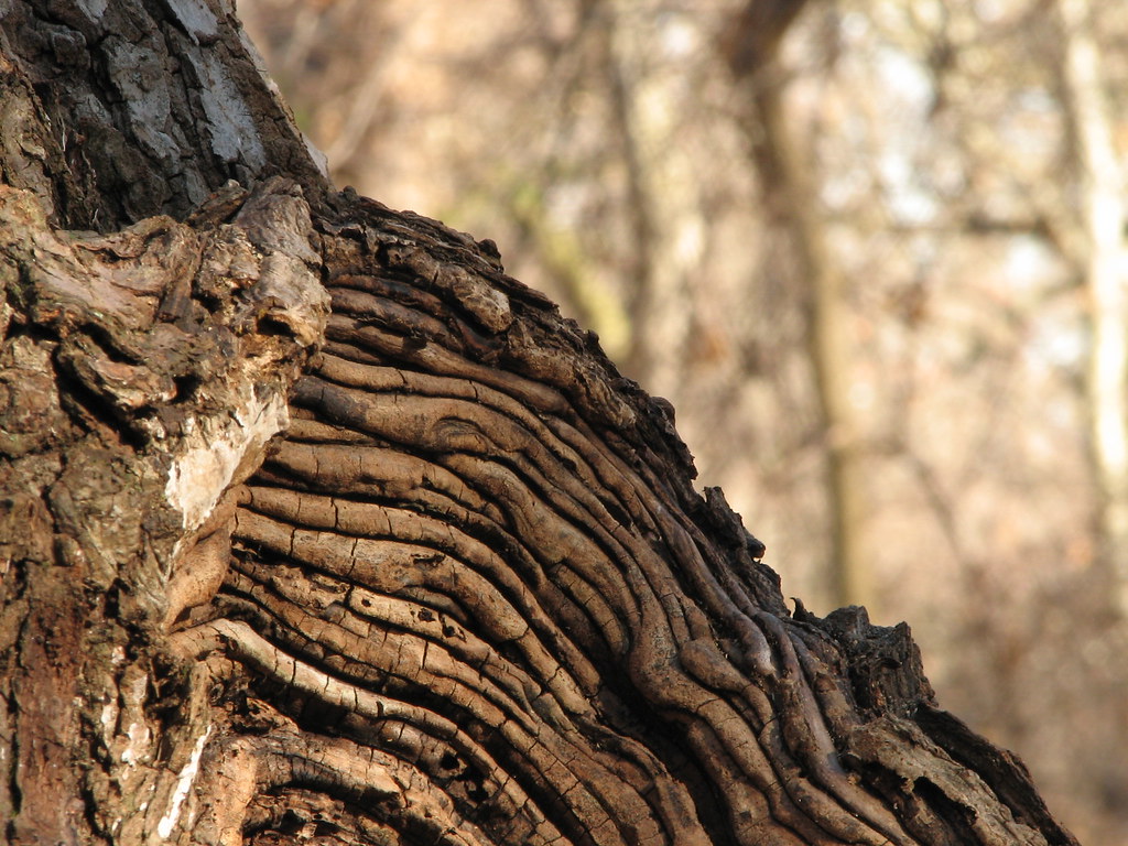
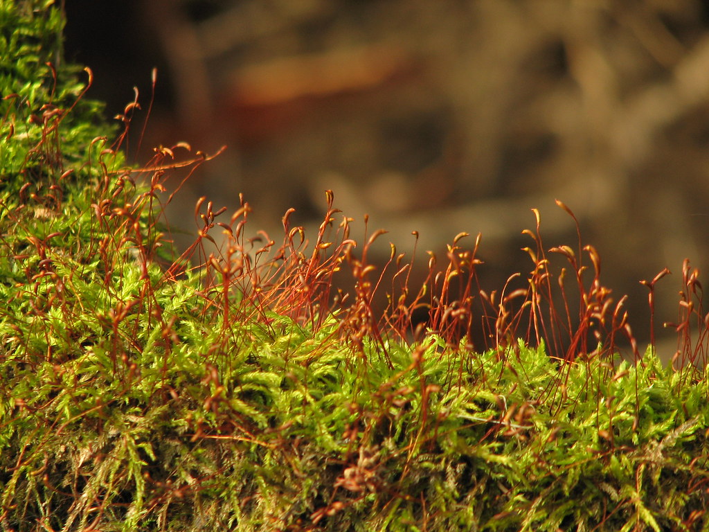
#3 - I like the colors and the sweeping lines but I think a slightly deeper depth of field could have put more of the foreground in focus to better stand out against the blurred background.
I personally really like the perspective and the simplicity in #2 and #3.








![[No title]](/data/xfmg/thumbnail/35/35871-d9de705fa64b06051419be6d3739d6ac.jpg?1734167599)