What's new

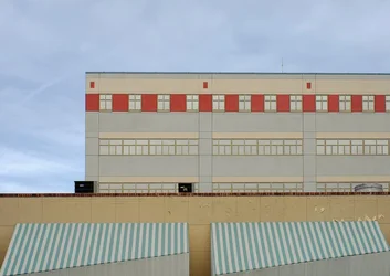
"Candy"

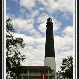
Given only the two choices I would go with the original, which has an interesting feeling of "unreality." I'd probably boost the contrast just a little and maybe do some selective saturation increases in the awnings and the red areas.
 
I like it in its low saturation original state, because to me the shot is about lines and shapes.

The colors are there, they just don't whack you on the head.

If the point was the colors (as in this is a colorful picture) then sure, pop the colors.

But here, even popping the colors, the image as a whole won't be about the color. So understating them, lets the composition stand out.
 
My wife pointed out that the red stripe may be too dominant, and pushing contrast and saturation in the awning might be a good idea. Seeing the edit above, I tend to agree, but I don't want to touch the shadows or adjust general contrast.
 
Last edited:
I've made some changes in response to comments, and replaced the original on my flickr. For comparison here is the original:

$candy.webp
 

Create an account or login to comment

You must be a member in order to leave a comment

Create account

Create an account on our community. It's easy!

Log in

Already have an account? Log in here.

Back
Top Bottom