

- Joined
- Sep 13, 2013
- Messages
- 1,545
- Reaction score
- 636
- Location
- United States, PNW
- Can others edit my Photos
- Photos OK to edit
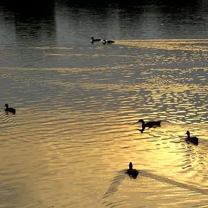
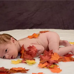
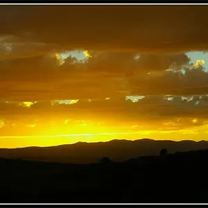
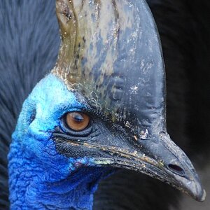
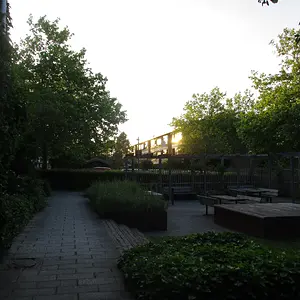
As much as I LOVE black and white, some images are best in color and I feel that this is the case with this image!!
What do you think - color ... or B&W?


What do you think - color ... or B&W?


![[No title]](/data/xfmg/thumbnail/31/31017-dec7e898bd21f99b70534f8d06a4154c.jpg?1734159103)

![[No title]](/data/xfmg/thumbnail/30/30858-42113a4c092a5983afa30e5c35cce4d0.jpg?1734158808)



![[No title]](/data/xfmg/thumbnail/31/31018-a537939c7ad9fc1126461101c651a8a0.jpg?1734159105)