reissigree
TPF Noob!
- Joined
- Sep 27, 2011
- Messages
- 261
- Reaction score
- 17
- Website
- www.flickr.com
- Can others edit my Photos
- Photos OK to edit
Took these photos at Canyon Lake located in Texas. These are all tone-mapped. Let me know what you think! I'd be happy to provide the originals!
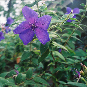
1.

DSC_0056-(2)_tonemappedWEB by reissigree, on Flickr
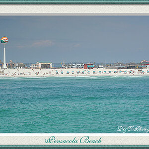
2.

DSC_0168_tonemappedWEB by reissigree, on Flickr
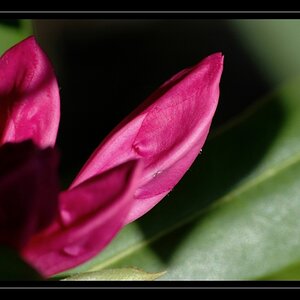
3.

DSC_0131_tonemappedWEB by reissigree, on Flickr
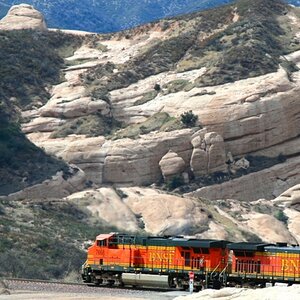
4.

DSC_0138_tonemappedWEB by reissigree, on Flickr
1.
DSC_0056-(2)_tonemappedWEB by reissigree, on Flickr
2.
DSC_0168_tonemappedWEB by reissigree, on Flickr
3.
DSC_0131_tonemappedWEB by reissigree, on Flickr
4.
DSC_0138_tonemappedWEB by reissigree, on Flickr
")


![[No title]](/data/xfmg/thumbnail/42/42274-5bec1b32caba5fed4a680bc5be4d0202.jpg?1619740083)
![[No title]](/data/xfmg/thumbnail/37/37626-4a6ffc3f17ab3a8e97170fda3276640e.jpg?1619738154)

![[No title]](/data/xfmg/thumbnail/42/42276-99df5da06c3e5dc83ae4bab11e935910.jpg?1619740085)