CC Please Amigos :)

Austin Greene

Been spending a lot of time on here!
Joined
Jan 6, 2012
Messages
1,472
Reaction score
855
Location
Mountain View, California
Website
www.austingreenephotography.com
Can others edit my Photos
Photos NOT OK to edit
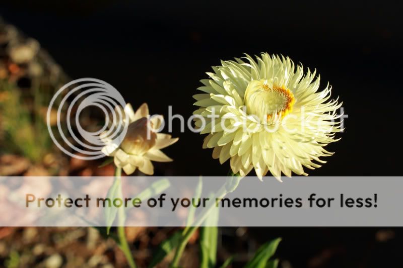
So there was a break in the rain today and I got out to practice a little more manual mode in the Arboretum. Any and all CC is welcome!
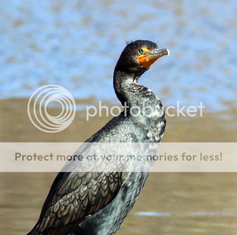
1.
IMG_1249copy.jpg


2. I wish I could have gotten his whole body, but with the hill I was on, there just would have been too much foreground imo. Cropped to be more of a portrait.
bird5.jpg


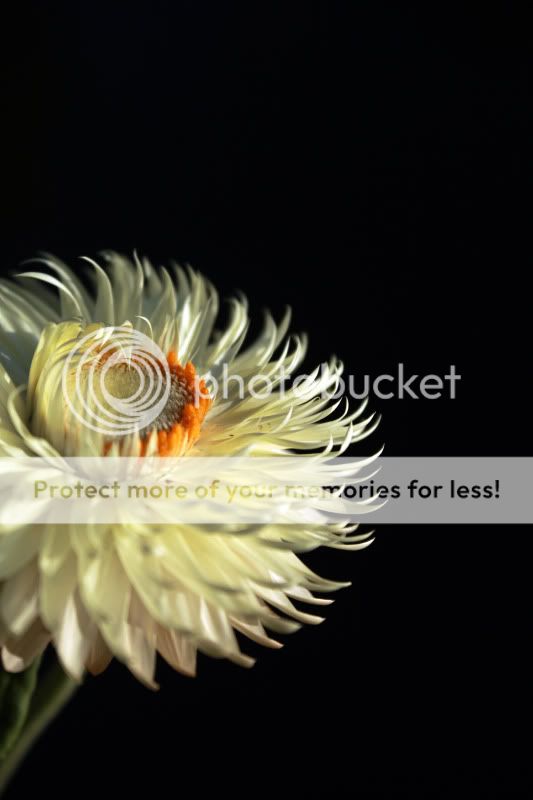
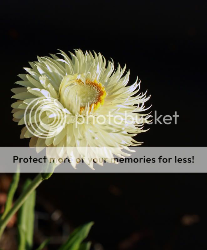
3. This is my favorite photo of the day. While it doesnt follow the rule of thirds, I personally like having the flower halfway into the shot. What are your thoughts?
IMG_1251editcopy.jpg


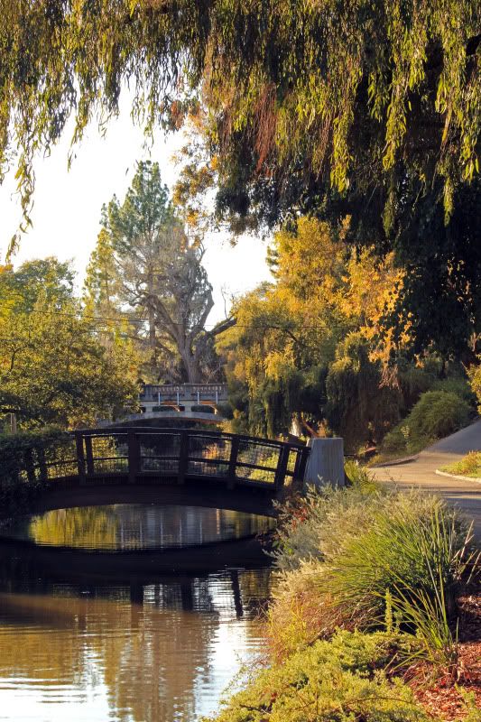
4. I messed around for a good 20 minutes on the exposure with this one right about sunset. The only part I don't particularly like is the reflection off of the far railing on the near bridge peaking out from below the closer railing, it almost looks like ghosting.
IMG_1230editcopy.jpg


As always, thanks for the CC! Your thoughts are really appreciated :)

Toga
 
Last edited:
1. I think would be better if the "extra space" were in front of the flower, rather than behind it. This is a general rule of photography, and I think it works most of the time. Leave the free space in FRONT of the moving car or person, and even in front of where something is facing. It just comes out more pleasing. You nailed the eposure though!

2. I like this one quite a lot, but the cropping looks off to me. It looks like you accidentally cut him off. I'd crop shoulders up, leaving a bit of room in front of him.

3 and 4. It seems like they're chopped off at the left sides a bit. The flower for sure. The landscape, there may not have been anything of interest there.

The depth of field is just right on the flower pix. I think from a technical standpoint, they are all great. I think you just need to do a bit of reading on composition and experiment some more.

Thanks for all the great CC and tips Jeremy! I will definitely keep the point about space being in front of the subject in mind! As for the cropping of the bird, I know that is an area I generally can definitely improve on. While this isn't meant to be any anything worth CCing (now that its cropped in some more, I see some CA on the neck of the bird), is this what you meant in general?

birdedit1.jpg


As for the landscape, I initially had a wider field of view, but there were a number of poles on the left that I felt didn't do much for the photo, so I opted for the current composition. With the flower, I definitely shot it chopped off a bit, this is what the plant looked like from a different, not so good (imo), photo.

IMG_1268editcopy.jpg


Perhaps I should crop in that photo, to show only the big flower. I'll give it a try :)

flowercrop.jpg
 
I love the eye on the bird, looks like a gem was stuck in there.. I don't like the tighter portait crop. It makes it OOF.
 
I agree that the first one looks like it should have the empty space on the other side,. It reminds me of when a person is looking out of the frame awkwardly with a lot of space behind them.

I think #4 is fantastic...big fan.
 
Thanks for all the great CC and tips Jeremy! I will definitely keep the point about space being in front of the subject in mind! As for the cropping of the bird, I know that is an area I generally can definitely improve on. While this isn't meant to be any anything worth CCing (now that its cropped in some more, I see some CA on the neck of the bird), is this what you meant in general?

With the bird, that's better, but I think it would be even better yet if you cropped closer to his face; not so much room in front. With regards to leaving room in front, it mostly applies to something moving forward or looking forward. This bird is looking more at you, like a portrait, so it isn't necessary.

The first crop on the flower is great. Perfect. The second one looks too tight to me.

You're doing great. Keep 'em coming.

As for folks not commenting, I think some people just like to look at the pictures. They know what they like, but don't know how to help you to get there, or they just flat don't like them and figure it's better to stay silent than to hurt your feelings. When I used to hang out here every day, I got tired of trying to type in my CC all the time. (and I type 80 wpm!) Imagine how it is to a regular who is not a fast typist?

Be patient, keep working at it, and read up on composition. I think you're doing great. Once you can satisfy even a few people here, you are already good enough to blow away most of your friends and family, I bet. :)
 

Most reactions

New Topics

Back
Top