What's new

CC Please

nathfromslg

No longer a newbie, moving up!
Joined
Nov 10, 2012
Messages
225
Reaction score
29
Location
Kolkata
Can others edit my Photos
Photos NOT OK to edit
Hi, these are another set of images I would like to put forward for CC

Please Ignore the Watermark

$[Group 0]-IMG_1209_IMG_1213aa-5 images.webp

$IMG_1132-Recovered.webp

$IMG_1192.webp

$IMG_1337.webp

$IMG_1671 22.webp
 
Technically speaking, number one is well composed, lit, and shot. The hands in pocket pose, not working.

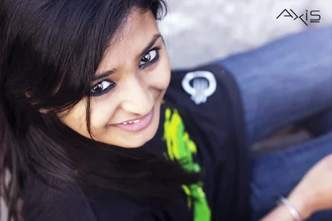
Number two, the angle you were standing does not flatter the subject's facial features. Additionally, although they are out of focus, the white circle and green smudge on the shirt are quite distracting.

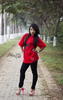
Number three, again, nicely shot, I like that you moved to the right and the subject was not exactly in the middle of the path or trees. But the wrinkles in her pants NEED to go. Honestly, they ruin the photo for me 100%.

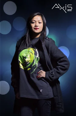
Number four, the main light needs to be softened drastically, it is quite harsh on the subject.

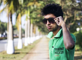
Number five, in my opinion, the subject needs more contrast away from the background. The green shirt, especially in the highlighted areas of the collar blend way too much with the trees and grass behind it.

I'm sorry if my critique is a little harsh, no disrespect intended. Overall, they are a nice series, just as we humans are, nothing is perfect.

 
Technically speaking, number one is well composed, lit, and shot. The hands in pocket pose, not working.

Number two, the angle you were standing does not flatter the subject's facial features. Additionally, although they are out of focus, the white circle and green smudge on the shirt are quite distracting.

Number three, again, nicely shot, I like that you moved to the right and the subject was not exactly in the middle of the path or trees. But the wrinkles in her pants NEED to go. Honestly, they ruin the photo for me 100%.

Number four, the main light needs to be softened drastically, it is quite harsh on the subject.

Number five, in my opinion, the subject needs more contrast away from the background. The green shirt, especially in the highlighted areas of the collar blend way too much with the trees and grass behind it.

I'm sorry if my critique is a little harsh, no disrespect intended. Overall, they are a nice series, just as we humans are, nothing is perfect.


Hey thanks for your critique,

in #2, the White smudge was the company I was shooting for for their T shirt series and all pics except the last one represent the company products

Thanks for the #3 CC for the crease on her jeans,damn I didnt notice it. Thanks,will keep that in mind the next time.

I was just wondering about different poses,can you help me out about poses and stuffs? any resource will help

thanks :)
 

Create an account or login to comment

You must be a member in order to leave a comment

Create account

Create an account on our community. It's easy!

Log in

Already have an account? Log in here.

Back
Top Bottom