What's new

CC this photo please.

JerseyJules

TPF Noob!
Joined
Aug 11, 2012
Messages
112
Reaction score
10
Location
The Armpit of America, New Jersey
Can others edit my Photos
Photos OK to edit
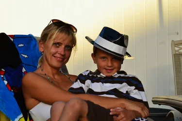
My wife and son, I like this playful photo, but the upper left looks blown out...The meter on my camera was zero'd...Is there a trick to preventing potions of the photo from blowing out??
$7869334372_fb7e9c7d31_h.webp
 
Meter for the background and use flash (preferably off camera) for your subjects. Or, take two shots and fix in PS.
 
Nope, no trick at all, but you do need to have a better understanding of how your camera's light-meter works. Start by re-reading the relevant section of your camera's manual, and then go here and read their excellent tutorials. Learn and understand the difference between the three common metering modes (wide-area/dynamic, centre-weighted, and spot) and when and under what conditions to use each of them.
 
C&C...well, for starters the focus is off...this is what is called "back focus". It spoils an otherwise nice snap. This Missus looks nice, and has a great summer tan and an impish expression; kiddo has a neat hat on, and looks like he's having fun...but for me at least, the focus spoils the shot as a "portrait", and kind of relegates it to the level of "wonderful family memory", but not a "photo-graph" (that being photo-graph said with a mock British accent...).
 
C&C...well, for starters the focus is off...this is what is called "back focus". It spoils an otherwise nice snap. This Missus looks nice, and has a great summer tan and an impish expression; kiddo has a neat hat on, and looks like he's having fun...but for me at least, the focus spoils the shot as a "portrait", and kind of relegates it to the level of "wonderful family memory", but not a "photo-graph" (that being photo-graph said with a mock British accent...).

Where is the focus off? What do you think threw it off? I have been not using any dynamic focus crap on my camera. I believe I tried to use their eyes as a focal point. Perhaps I was too close or far away for the proper DOF?? I think perhaps the F/stop was too high..
 
The boy's knees are out of focus...her necklace, the closer side of it, is slightly out of focus...the focus is not quite placed right. It's slightly OOF. I would agree...the f/stop used has not given "quite" enough room for them to be in 100%, critically-sharp focus. For example, look at the chair-back on the right hand side of the frame, and see how sharp that woven part looks...they are CLOSE to being in good focus. Looking at the boy's knees, you can see the foreground defocused zone, as it is called...and then the closer edge of her necklace STARTS to come into almost-acceptable focus....but her face and hair on her forehead are not quite yet in the solidly IN-focus zone...to me, I see visual clues that the BEST focus is actually BEHIND the plane of her face. This is "close", but still what I consider "missed" focus. Now...in hand grenades and horse shoes, close counts...in THIS shot, I see what is called "back-focus". It is not horrible back-focus, but it is,indeed, back-focused.

 
It looks back-focused to me as well. You nailed the chair. A wider DOF would have helped, but focusing at the desired spot in the first place is the best way to do it. There are also a few distracting elements: chair/table on left, shadow on wall, trash bin, and the busy towel. Good job on getting both subjects in a nice pose with strong eyes directed at the camera. So, better metering, off-camera flash or reflector, focus on subject's faces, remove distractions or frame differently.

Getting these little things right isn't always easy. I drive my family nuts for casual family photos because I have them move this way and that way, I move objects out of the frame, drag my subjects into better light, etc., and all the while they're wishing I'd just take the damn picture.
 
Couple of things. I won't discuss focus, as Derrel and Jaemie already addressed that. Zeroing the lightmeter means that when you blenderize all the pixels in that image together, you'll get a grey that is about 18%. The very bright area on the top left fooled your meter, and made it underexpose the important parts like your wife and kid. So now you know, meters are dumb, and really suck at mindreading your intentions. In this situation, changing the metering mode to "spot-meter" and taking a reading off either face would have given you an exposure that is more useful for your subjects.

Look at the image and notice where the shadows are - that tells us that the main light (casting the shadows) is coming from the upper left. The right side (our left) of your wife's face is a bit dark, but more or less decently lit, while the left side (our right) is in shadow. Your son's right side is darker than your wife's (because the light source is further away), and his left side is much too dark. Now if the light was behind you to your left, the light would have been much more even. That can be accomplished by moving your subjects so that the illuminating light is in the right place. Or, you can use a fill flash to fill in the shadows.

What you are seeing is the "quality of light" that has photographers all excited - its direction, its size, and its intensity all play a part in creating a pleasing, well-lit image.
 
i like the image ....
I think having a shady part of the face below his hat gives him a innocent villain look ;)
Which things distract me is the diagonal lighting seen in the background and the shadow of a pole
The deep blue part of the clothe on her left side is distracting where as the chair seen on the right side is non-contributing
In spite of its short comings and the focus issues( i am too kindergartenish to utter anything regarding them) i like the image for its candid appeal :D
 
Keep in mind it was a split second shot with zero set up other that "hey guys, smile"..I was at a pool party for my friends kids birthday, so setting up reflectors or lighting was out of the question. And I hate the way the in camera flash makes everything look fake..I probably could have done a better job had I taken the time to actually set it up..But for the moment, I tried my best. I saw something that looked cool and scurried to get the camera and shoot..lol
 
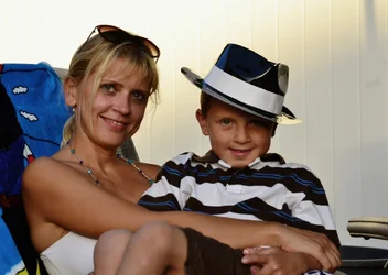
De-saturate colors a hair and crop, the blue towel is dominating visually and her face looks a little reddish. Open up the darker tones a little to flatten out the apparent contrast a little bit. You get this:

$foo.webp

Yes, focus was missed a little. Don't get too excited about that, sharpness is nice but it's not the be-all and end-all of an image. Also, don't worry about the blown out background. Who cares if the background is blown out? The faces are, if anything, a little underexposed, and this is a photograph of people, not a wall. Right?

Composition's quite nice. I like the strong diagonal flow upper left to lower/middle right.
 

Create an account or login to comment

You must be a member in order to leave a comment

Create account

Create an account on our community. It's easy!

Log in

Already have an account? Log in here.

Back
Top Bottom