What's new

CC welcome take II

amolitor

TPF Noob!
Joined
May 18, 2012
Messages
6,320
Reaction score
2,131
Location
Virginia
Can others edit my Photos
Photos OK to edit
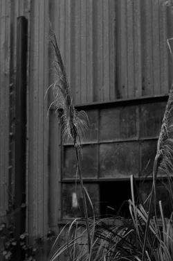
This is a new conversion that brings out the subject a little better. I also realized that the version of this I posted yesterday I had gone histogram-happy (which is a subject I have actually ranted against recently, arrrg) instead of respecting the original light. This was shot on a gloomy rainy day, and it should look like that, darn it. It would, I think, be improved by some burning to push the background further into the background, and maybe I'll get around to that. I haven't go an image editing rig handy right now, though. And, frankly, if editing would change it from "bad" to "good" then everything I believe about photography and art is wrong.


$DSC_0166.webp
 
Really could use some more contrast. From across the room it just reads "gray".

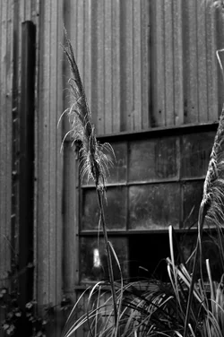
$plant.webp
 
I think you hit it on your previous post about differentiating your subject from your background, but I don't see it.

If it were me, if possible, I'd wait till some sunlight fell on your subject and the wall still in shadow.
 
  • Thread Starter 🔹
  • Banned
  • #4
This is lovely!

I hope I don't come across as arguing with critique, I don't mean to, and I hope you will forgive me if I accidentally slip a little arguing in! My first instinct in handling this file was certainly to punch up the contrast, to go for the full tonal range and so on. However, after a little time I remembered that my purpose in shooting this was to capture the gloomy/grey/abandoned feel. Whether I succeeded or not is another question. In any case, for my purposes the image has to be grey and dim, visual drama stands in the way of the feeling I am aiming for. Better light would, likewise.

The comments I got on the first version made it clear to me that I had not articulated the subject adequately, and perhaps it simply cannot be in this image. That's ok with me. Disappointing, but ok. Derrel also made some cogent points about the background, which I may attempt to deal with better later. Whether there is any hope of success here, I do not know and in a way I don't care much. The process rolls on.

Anyways, I truly do appreciate the commentary, and I see and understand the points you are making. That they don't align with my purposes here doesn't matter. Perhaps my purpose is dumb. That's ok too!
 
Last edited:
I forsee no silk purse resulting from working with this file...not an evening clutch...not even a little coin purse...
 
I would not spend much more time or thought on this one Amolitor. I didn't make a comment on the other thread, I don't know why.

It just doesn't work for me. The visual elements are not cohesive enough to tell a story on their own. You've got a very messy foreground element that doesn't work. It could work, maybe, if there wasn't another stem going out of right frame.

It doesn't look carefully composed, which is the main problem. You're not going on much here. You don't have good light, you don't have a very interesting subject, so the photographer must bring something to the table through composition. I would go out and take another picture and leave this one behind for now.
 
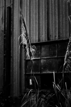
I got carried away and tried to bring up the bloom on the high lights.

$plant2.webp
 
Ya know, that "white thing" in the window of the barn is just KILLING the background...

and that second stalk of grass leading the eye out of the frame on the right hand side..."ehhhh".

I know, this is the second day in a row that this same image has been posted for C&C. My question is ,"Why? Why the **** is this being posted in a second thread on a second day?"

As so many posters have responded before me, let me ask you, amolitor, the OP, a few questions:

1)What did you hope to accomplish by taking this photo? What did you set out to show or convey?
2)What aspects of this shot do you think work, and what aspects need improvement?
3)Do you consider this a successful translation of your original intent to its final form?
4)How might you have improved this image, either at the capture stage, or in the digital darkroom?
 
I like this one better. It still portrays the forgotten feel, but is more interesting.
 
This captures the light you've described, but I have to agree about the composition. I think the dark post on the left and the stuff in the upper right corner bother me the most, followed by the light spot on the window that others have mentioned (although the spot is easiest to fix). A vantage point that is higher and to the left (if possible) would have helped this by putting the stalk against the window, which is darker and more interesting than the metal wall, and isolating the stalk from the other one, which is only partially in the frame anyway.
 
1)What did you hope to accomplish by taking this photo? What did you set out to show or convey?
2)What aspects of this shot do you think work, and what aspects need improvement?
3)Do you consider this a successful translation of your original intent to its final form?
4)How might you have improved this image, either at the capture stage, or in the digital darkroom?

Basically, I felt a couple of things when I saw this scene. I was struck by the contrast of the decorative grass with the dilapidated and abandoned industrial facility behind it, and I felt that sense of dilapidation together with the morose and gloomy dampness of the rainy day. The photograph's intent is to convey those things, that dilapidation and abandonment, that wetness and gloom, and layered on that the slightly incongruous decorative grass doing.. what? in this place.

I think it conveys gloom and dilapidation quite well, but I think a better job can be done with a better editor. It does not convey the odd sense that the grass brings, I think, because the grass isn't very visible. I suspect that some people are not looking at it larger (Fred Berg, the subject is surely obvious if you click on it and make it bigger. It's the large object that's in focus and more or less centered in the frame). This can be improved, I think, by bringing out the grass more and separating it from the background material better. Incidentally, this part works better in larger sizes. This is a rare picture that I think is utterly worthless in the thumbnail, but fairly interesting (to me) in larger sizes. The subject such as it is, is tonally confused with the background and fairly finely detailed and difficult to see at all in smaller sizes.

Is it successful? Not entirely, see remarks above.

The photograph is struggling to be a picture that anyone wants to look at. The muddy tonal values make it visually uninteresting, so it's difficult to spend any time looking at it. There are compositional problems, apparently, that cause other people's eyes to go to the wrong places (these are things I can grasp intellectually, but at a gut level, since I took it and know what I intend, I literally cannot "get" at a visceral level). There are really TWO things a photograph needs, to be successful, and conveying the idea(s) is only one of them. The other one is that it has to hold the viewer's attention long enough to get the ideas across, and this is where this one really falls down, I think.

There's a conflict between the mood I want to convey, and visual interest. I think I can improve this, creating a little more eye candy to hold the eye without losing the mood, with some curves adjustments and burning and dodging. It won't be any breakthrough change, though, just an incremental improvement.

The compositional issues people have I find interesting, since I deliberately put most of that material in there like that. The black vertical, the stem leading out of the frame? I put them there on purpose, to frame the main thing in the middle and to give some visual interest to the background, and to create a series of echoed verticals across the frame (well, more or less, I really just shoved them there because it felt right, but after the fact I'm pretty sure those are the reasons). The white object in the window? That's another window on the other side of the building, again, I was looking for some visual interest in the background, which is incredibly flat and dull.

My model for this sort of image design is a still life oil painting of a certain sort. The painters will put the still life against a plain background, but then create all manner of vague shapes and colors, basically just setting a mood with abstract masses of color in the background. You hardly notice the background unless you're looking for it -- you see it only as a plain wall, or some vague forms, but in reality it's a riot of moody colors and shapes back there, but rendered subtly.

ETA: The decorative grass is Pampas Grass, and for all I know the stuff grows wild around here. Anyways, it's a decorative grass commonly found against walls in a finer class of landscaping, NOT along side of rural roads against the wall of some abandoned industrial building.

 
Oh, and, hey. Thanks, everyone, for taking the time to comment, and I really hope I'm not coming across as arguing about it. I see what y'all are saying, at least intellectually, and nobody has said a single thing that I don't think is basically correct.
 
One thing I think you're forgetting is that the eye is also drawn to the part of the image with the greatest contrast. The background has greater contrast than the foreground in several places. With a subject that isn't very interesting to begin with, you need ALL the compositional elements pointing towards it.

If you're going to try to get me to look at a piece of grass, you better do some compositional gymnastics to get me there. A centered composition and focus will make me just think "well, that can't be the subject, can it? Maybe something interesting is going on in the background."

Also, I don't think that the background building is dilapidated enough to very obviously convey the feeling you wanted. It looks fairly normal. The window looks like it could just be open. It doesn't obviously read as broken. The windows are dirty, sure, but not in an obviously decrepit way. The walls are fairly new-ish looking.
 
I think I can understand the image you are trying to convey but it's just buried in there too deep for us to really "see" with our eyes,. I tried out a few things on it just for the mental excercise but I don't think I did anything to improve upon your original; I just made it bad in a different way. Maybe time to re-shoot and start over ?

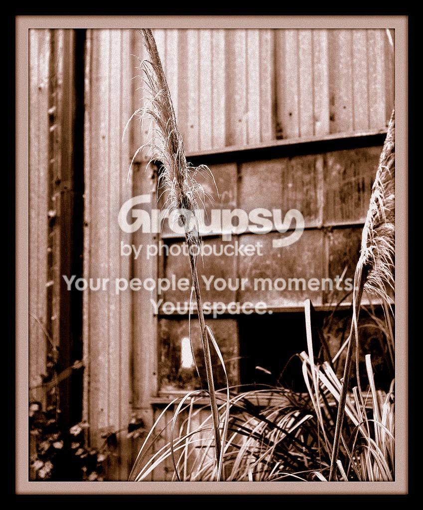
barnwindow.jpg
 

Create an account or login to comment

You must be a member in order to leave a comment

Create account

Create an account on our community. It's easy!

Log in

Already have an account? Log in here.

Back
Top Bottom