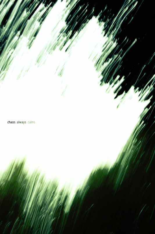
please comment. i would like some help with the words rather than the image. what did you first think when you read the words? was it a positive or negative reaction?
I figured I would see some type of soothing or caring lifestyles type of photo?
Not that what you have is 'negative', just not what I was expecting. What is it going to be used for?
i like it! it's more of a thing we would critique for it's graphic design parts though, not the actual photographic side of it. it would make good stock photography (that might sound insulting, but it's good in this case).
I'm not sure what it is you're saying. When I was a kid, my dad always told me that things had to get worse before they could get better. This would really irk me. I was looking for comfort, and not rational about the relativity of words.
I like the type specs.... the choice of a bold sans serif face, all lower case, graduating from dark to light in the colors of the image.
Still... I'm not at all clear about the concept you want to convey. Or, put more simply, what are you trying to say?
I might try moving the words down so there not so centered vertically and increase there size slightly. Also you could try changing the font, size, and or bold chaos to get it to pop out a little more than the rest
By moving the font down it wont be centered adding to the illusion of chaos... something centered almost always adds to the illusion of control through its placement. Also it would create more of a solid white mass to contrast off the black.
I like the text. Good job on the colors and the typeface. I think the point size suggests a calming effect. Other than that I am not getting the calm part. I would play with the tracking. The text could look cool spread out. Also try and capitalize the first letter of each word. Drop shadows are fun as well, but I think they are a little played. The best way to see what you like may be to print them 8x10 or 11x17.
Type and the way we view it is a real art form. Personally I love it. I will not get into the slow disrespect I see of it. Not your piece, but typography in general. If you really want to get silly check out "Designing with Type" by James Craig. Or any book on typography.


![[No title]](/data/xfmg/thumbnail/37/37624-7f9c9a5c8c7bcb5e62f67313e2e48dbc.jpg?1619738153)
![[No title]](/data/xfmg/thumbnail/42/42021-ffc326f5dc5b4c65ce53935e6e9e4338.jpg?1619739980)
![[No title]](/data/xfmg/thumbnail/32/32930-09414fc020c2a60a456ff59a05c5ef8f.jpg?1619735759)
![[No title]](/data/xfmg/thumbnail/37/37626-4a6ffc3f17ab3a8e97170fda3276640e.jpg?1619738154)
![[No title]](/data/xfmg/thumbnail/42/42022-b164b48fbcd31e32040c4983ecb8983a.jpg?1619739981)
![[No title]](/data/xfmg/thumbnail/37/37627-c3d3ca879cdfbdb9e35acdcc7fcd4b3e.jpg?1619738154)