What's new

Chaotic themes in nature

unpopular

Been spending a lot of time on here!
Joined
May 17, 2011
Messages
9,504
Reaction score
2,004
Location
Montana
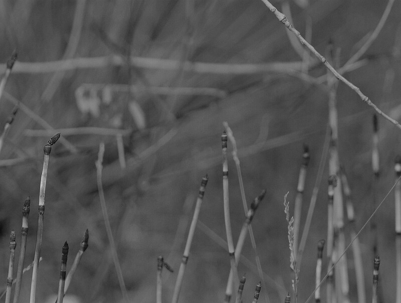
What I found interesting in these images is the complex textures formed by nature and the contrast in form and tones between species. I was not as interested in traditional composition in these, but tried to frame elements according to composition yet while still maintaining a more "open" composition without clearly defined hierarchical relationships (an ongoing theme). CC always welcome.

6541977991_7f85aea98b_b.jpg


6541978341_d238a1b131_b.jpg


6541984497_e2540fd99f_b.jpg
 
Last edited:
The first image (alone) matches your theme here; last one is really the odd one out

regards :D
 
I am prob going to reshoot that one with a tripod and a with more DOF. I really think there is potential with the snake grass, I really like how it contrasts with the rest of the flora, if I can get the composition right.
 
I think these images are too low in contrast to make the most of the plant matter. THis is one of the very few subjects where threading on some old-school B&W filters might very well lead to some very interesting final images. some years back, Dirk Vermierre did some tests with using traditional B&W filters (red, orange,green,and yellow) over the lens when shooting his d-slr and then converting the images to B&W in post. The filters made a significant difference. I can appreciate what these images are about, but I think that visually they are dull...flat...hard to really "feel" the plant matter...the textural clues are somehow not strong enough.
 
Hi Derrel!

As I am sure you've guessed, the contrast was a choice here, I wanted them to have a very wide dynamic range and I didn't want one thing to "pop" over another. This doesn't mean it worked out though, and I have been battling if this is the right choice or not.

I agree that filters can be useful, but I am not 100% convinced that they are doing much more than channel mixing. However, noise still may be positively affected - especially if using filter colors which correspond to problematic channels provided that exposure is factored.
 
The filters work quite differently than channel mixing. There is theory and supposition. Then there is actual modification of the light and what the sensor records.

Imagine filtered light AND channel mixing on the same image...
 
Being that in front of the sensor there are little bitty RGB filters which correlate to the RGB channels, I'm not totally sure how the channel mixer would differ aside from providing more exposure to one channel over the other. This, however, may be the point.

I will play with the contrast a bit, but every time I try I kind of have returned to this subtle, flat rendering.
 
I think these images are too low in contrast to make the most of the plant matter.

My first thought too. I like the theme and the low contrast helps with the chaos but to the point where it is hard to read. The second one is better but mostly, I think, because there is less chaos.

As far as the filters, why not try it and see for yourself. Filters that very few people use anymore can be had pretty cheap these days.
 
I think these images are too low in contrast to make the most of the plant matter. THis is one of the very few subjects where threading on some old-school B&W filters might very well lead to some very interesting final images. some years back, Dirk Vermierre did some tests with using traditional B&W filters (red, orange,green,and yellow) over the lens when shooting his d-slr and then converting the images to B&W in post. The filters made a significant difference. I can appreciate what these images are about, but I think that visually they are dull...flat...hard to really "feel" the plant matter...the textural clues are somehow not strong enough.
Kudos to you, you hit it on the nail. This is exactly what I thought! Image loos flat and dull
 
I've increased the contrast on this image, the third I am going to be reshooting and the first I'm keeping the way it is, contrast just doesn't work well with it, perhaps aesthetically but not conceptually. It adds a sensation of depth that just isn't felt when I made the exposure.

I didn't keep the original on flickr, so sorry for the lack of comparison.

6558346455_77a29c9529_b.jpg
 
I have to agree with others about the first, but I like the second one as is - an interesting use of shallow depth of field to overlay one pattern on another. I think increasing the contrast on this one might ruin its subtlety.
 
GAHAHHHHH!

I looked at my original and compared it against what I am looking at on this website, and yes. My original is too flat, but my web browser is rendering them more contrasty (prob a gamma issue on my end).

I'm having a hell of a time with these. For some reason color management is just not working, unfortunately, it's not working for me but is working for everyone else.

---

As for the second edit, I think I like the hilights in the edit, but the shadows of the original, an initial test just with the jpegs indicate that the edit when placed on lighten mode at 65% works nicely over the original. GTG do stuff right now though. Thanks for the input :)
 
Last edited:
Create an account or login to comment

You must be a member in order to leave a comment

Create account

Create an account on our community. It's easy!

Log in

Already have an account? Log in here.

New Topics

Back
Top Bottom