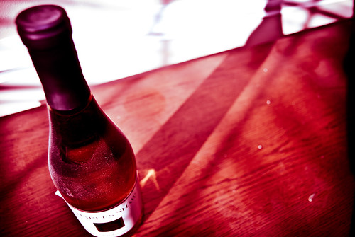
I don't think it screams vertical orientation at all. It screams "why did you clip the bottle bottom".
I like the dividing line, and particularly how it connects to the curve at the bottom of the foil wrapper, keeping that line continuous.
I don't like the black bob on the right edge, but I do like the lines the shadows create. There is more subtle interest there than you all are giving credit.
Vertical framing would have lost all that, and become a much more of a bore.