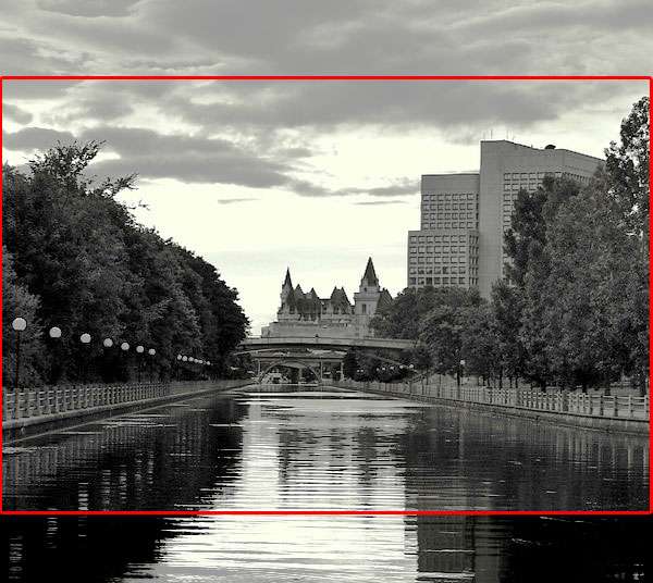
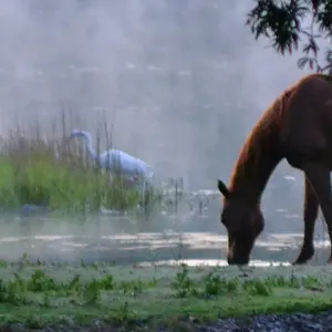
This is a nice composition but my impression is that there is too little tonal range in the dark areas and too much sky. Thus the eye can't easily separate out the structures in the lower half while the bright tones of the sky pull the eye away.
So I tried to demo a fix - used a curves layer to expand the dark areas and then cropped.





![[No title]](/data/xfmg/thumbnail/42/42492-60144191c917c21139f8acd72f6ba090.jpg?1734177011)
![[No title]](/data/xfmg/thumbnail/33/33493-f055dbbe7f00f271d3959dd3a6482165.jpg?1734163605)
![[No title]](/data/xfmg/thumbnail/35/35597-714b74cc48992e5353856abfe325df68.jpg?1734167220)
![[No title]](/data/xfmg/thumbnail/42/42487-e35b2848c41aeeb5a93f21809f036a1d.jpg?1734177009)


![[No title]](/data/xfmg/thumbnail/40/40308-f92e28f094216c151f3ad1fd7453c99b.jpg?1734174716)
![[No title]](/data/xfmg/thumbnail/35/35959-c7e267b1e7e08d889fe1a4fa28766c11.jpg?1734167798)