Your retouching seems nice, but the depth of field and lighting seem to be lacking. As far as lighting goes, I'd like to see more sculpting. As far as depth of field goes, there isn't nearly enough in focus and I'd like to see you shoot using a depth of field that isn't shallow.
Your retouching seems nice, but the depth of field and lighting seem to be lacking. As far as lighting goes, I'd like to see more sculpting. As far as depth of field goes, there isn't nearly enough in focus and I'd like to see you shoot using a depth of field that isn't shallow.
My initial thought was "This is great!" Then I read Dan's comment and realised that he's right. Dan sets a high standard and he's challenging you to up your game even more than you have done so far (which is a lot). As we used to say in the '80s - Go for it!
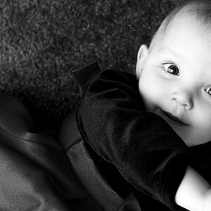
I don't mind a shallow DoF in portraiture, I think it's an artistic choice that when done well can really work. This is close, there are just a couple things that, for me, take it down a notch.
You did well nailing the focus on her right eye, but that seems to be at the far end of the focal range. Her left eye is appreciably OOF while a good portion of her right sleeve, out in front of her face, is in focus. The turn of her head hurts when it comes to keeping both eyes (and her nose and mouth) reasonably sharp - I like the pose, and I don't think I'd mind that left eye being a little OOF (as it's tucked away behind her hair anyway), but I'd like to see the eyes close to the same sharpness. I think the focal range could have been moved back, get that left eye at the expense of her sleeve, but it is tough to make that fine an adjustment live.
Perhaps made more obvious to me by her eyes (theoretically sharing the viewer's focus) being of different sharpness are the other elements which are sharp. I can get past the sleeve, it's sandwiched between the dark background and the shadowed portion of her top and isn't catching that much light itself, so I'm not drawn to it. However, her chest is a decently sized portion of the frame that is in focus, catching a good bit of light from above, and has fairly high contrast with the shadows above and to both sides. I'm not saying my eye is drawn from her face to the bottom of the shot, but when I view the full image there two competing areas.
I'd also suggest maybe taking a look at this as a square crop, which is approximately how it first appeared on my monitor before I zoomed out. That would put the bottom of the frame somewhere around her tattoo. This compositionally makes her face more prominent (it's entirely in the upper half of the frame now) and removes the lower competing sharp zone.


![[No title]](/data/xfmg/thumbnail/41/41757-2c3d7911242848ab00e3e9aaafa24381.jpg?1619739882)
![[No title]](/data/xfmg/thumbnail/38/38443-d3f00036791c5f915b132320c9ac8865.jpg?1619738614)
![[No title]](/data/xfmg/thumbnail/41/41755-a922f39cc29ff8f6e66a197508bf99f3.jpg?1619739881)

![[No title]](/data/xfmg/thumbnail/33/33422-d1097b04586502aba932c8d5409d8026.jpg?1619735961)
![[No title]](/data/xfmg/thumbnail/41/41758-1a91d93383c843959cb160b7ac7e762e.jpg?1619739883)