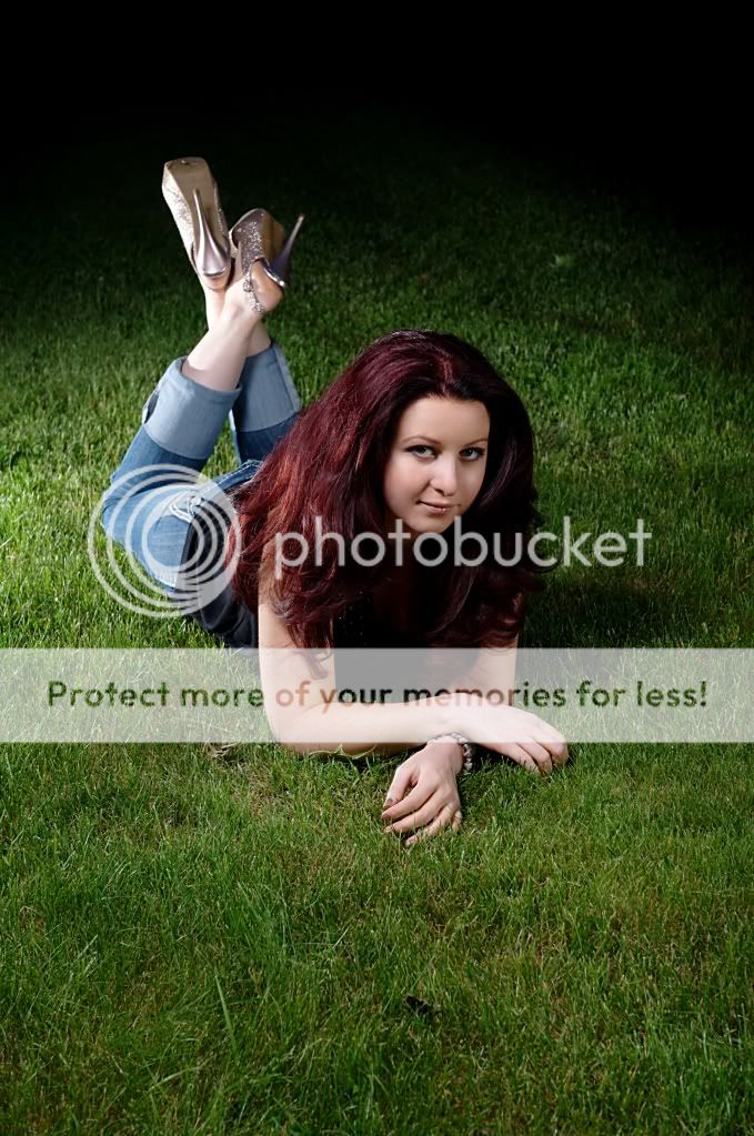
#1. This one has plenty of potential. Nice soft light on the subject, a nice lighting pattern on her face and a nice ratio. However, the lighting pattern on her face is broad (lighting the close side, not the far side), and in terms of portrait lighting, it's often preferable to have 'short' lighting instead of broad. Also, there is no catchlight in her eyes, well it looks like there is, but it's tiny and from the off side (I'd guess it's from the fill light)....and overall, there isn't much light in her eyes. Since she is so low to the ground, I'd suggest getting your main light low, or maybe using a reflector down low, to get more light into her eyes & face. On that point, her front seems like it could use more light. Her face seems to be floating in a sea of darkness created by her dark hair and clothing. On one hand, that is good because it focuses attention on her face...but I'd still like to see a bit more exposure there. Here feet/legs are too bright. They should not be the brightest part of the image. Lastly, I think a tighter crop would be better, as too much of the image is darkness or grass, but you would have to change the aspect ratio for that...maybe square?.
#2. Again, you have nice lighting on her face and a nice ratio. A great tip for anyone is to use something like a tree, like you have done here, and by getting her close to it, you 'subtract' light from that side of her face, creating a ratio.
When looking at the whole image, I think it also could benefit from a closer crop. There is more tree than girl...and I'd assume that your subject is the girl, not the tree

. Also, you have to watch out for bare arms in a shot like this. So much pale flesh becomes a bright spot in the image, and thus distracts attention away from the face, where it should be.
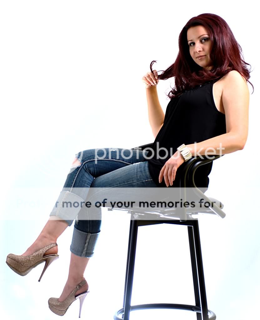
#3 has some problems. The contrast is really high, with really dark shadows and blown highlights. It's making her skin tones look bad and the background doesn't look good (on my monitor at least).


