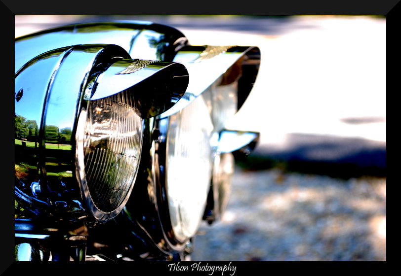
I'm not over the moon with #1, nice dof, good reflection, (I'd consider cloning out the wing mirror chrome smudges though) but the saturation seems a little high to me, sorry.
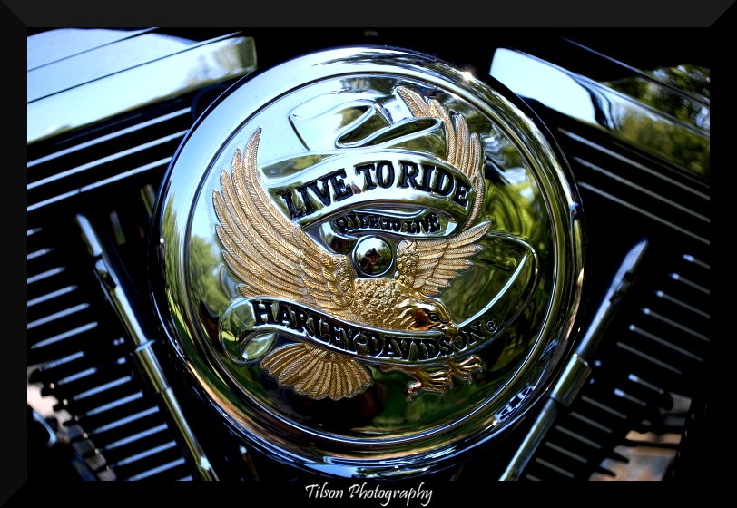
2 I really like. Good use of the reflective surfaces, good contrast and good crop.
perhaps it's just me but I think I'd really like to see number one focused on the main light in the center. I just find the other lights distracting when focused on the small light. I wouldn't change a thing on the second one nice job.
I actually really like the first one. I agree that you could try focusing on the center light, but I like it as it is too, saturation and all. I think it pops like that! Keep in mind, I'm still "training my eye", but I wanted to give you my 2 cents. :thumbup: