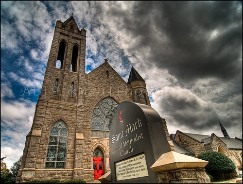
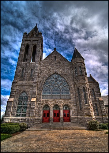
The second one strikes me better than the first because of the feeling of space. The large, looming cloud in the first one -- in the upper right -- seems to be encroaching a little too much. In the second photo, the dark cloud creates a natural vignette but it dominates a little too much in the first image.
You've got beautiful light on the church, though. Really like that part.
The second image is very nice; much simpler in composition. It's a nice lead-in shot and the red doors make for a good focal point. You've put them in just the right place. I don't feel like my eye is taken away from going bottom to top.
")


![[No title]](/data/xfmg/thumbnail/37/37609-a1984365804384f841d8245ae7e3b9a7.jpg?1734170735)
![[No title]](/data/xfmg/thumbnail/35/35597-714b74cc48992e5353856abfe325df68.jpg?1734167220)


