color, b&w, or neither...opinions wanted

linpelk

TPF Noob!
Joined
Jan 1, 2009
Messages
406
Reaction score
0
Location
California
Can others edit my Photos
Photos OK to edit
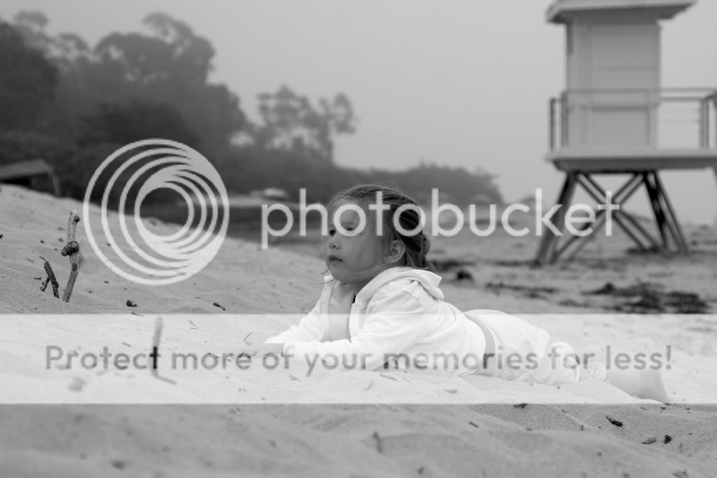
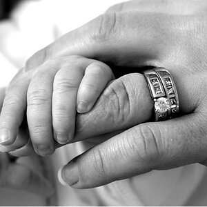
Hi, I like these pictures I took of my daughter at the beach and I was going to have them printed for the refrigerator (so not too serious) I was just wondering if you thought they would be better in color or black and white. If you think the pictures are just plain terrible, then it's ok to say that too as long as you tell me what is wrong so I can improve next time. I am pure amateur (just thought I'd let you know so you can put it in perspective). I also have NO EYE for post production so if you have any advice on touch up, tell me what you think I should do. Thanks!!
IMG_2241.jpg


IMG_2217-Version3.jpg


IMG_2248.jpg


IMG_2238.jpg
 
i really like number 4 that would look great printed, leave it in B&W, im a big fan of it
 
Try them all in B&W. I really like all 4 shots. I think #1 especially would be better suited to B&W.

<edit>

The only thing that gets me about #4 is that you cut her legs off.
 
The only thing that gets me about #4 is that you cut her legs off.

Oh, darn!! I didn't notice until you mentioned it! I'm showing my NEWBIE colors! Thanks for pointing it out.
 
I like #4 for a fridge pic and even though the legs are cut off it's in an acceptable area.
 
I think the last two are great. The first two don't really say anything to me, and they should. The first one especially. When ever you do dramatic shots like that, you want the shot to get the mind of the observer churning about what is trying to be said through the picture.

Usually the person looking comes up with their own answers as to what is being said through the image, and they are rarely the same answer. However, you want the person looking to use their brain as to what the message of the image is. Number two starts to get the mood going, but then it falls off because there is no look or expression to her. Even angle could have changed this I think. You lose the image once you look and realize that her eyes aren't there; her expression is not there. She looks empty.

The third and forth one REALLY do what I was talking about. Her eyes are wide open, she is looking in a direction with no smile or frown. It looks like she is deep in thought about something, and starts to make the viewer wonder what she is thinking about. A result of this can be that the viewer thinks of their own situations and then empathizes with the girl in the picture with thought. It makes you go, "Hm, I wonder what she is looking at, probably the beautiful ocean." So, now the viewer is in love with the image, because they feel like they can relate to it, they feel it.

I hope this helps you out some.
 
Thanks for your input on the pictures. You are absolutely right about shot #2. You don't see her eyes, nor does it show any particularly dramatic body language, etc to portray interest to the observer. Shot #1, I just liked how the lines of her body seemed to flow in the same direction as the little hill behind her. I just liked how feminine she looked...to me...but it's nice to hear someone else's opinion. Thanks for the compliments on #3 and #4. I'm glad that you think #4 is still nice even though I successfully chopped off her feet.
 
I think you should work on the contrast.

I know absolutely nothing about what looks right in post production so I'm always afraid I'm going to make a picture look worse when I mess around with it. I just went back to my picture and increased the contrast a little, but it feels like I need to increase the exposure then as well because the picture gets too dark. Is this the right thing to do? I know when you just change a picture from color to B&W it looks kind of flat so I KNOW I need to do something to make them more vivid. I just don't know what it is I need to adjust. Forgive my newbiness ;)
 

Most reactions

Back
Top