Hmm... I did try this myself and found the difference in mood to be quite dramatic - even with only one curve point eg. input: 224 output: 192 (although I normally use 2 curves adjustment layers).
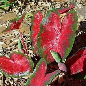
Color has the most interest. I don't find the subject that interesting, the design is too chaotic. If it was simplified and maybe a subject to focus on, it might have more impact. Maybe a colorful bug on the grass.
Well, agains all expectations, i'm not that much for the sepia. I prefer the colors, but the B&W just gives out a different feeling, it's kinda colder or something...
Anyway these are awesome pics!



![[No title]](/data/xfmg/thumbnail/32/32433-abebb6cea0cf29d5f27d9054c7b0664e.jpg?1734161774)
![[No title]](/data/xfmg/thumbnail/38/38740-d1a7721cf77e9309a9b4a4829c65fdd4.jpg?1734172602)
![[No title]](/data/xfmg/thumbnail/30/30882-ce388519574371448d7493784524607a.jpg?1734158883)
![[No title]](/data/xfmg/thumbnail/36/36674-2a99a33f8b4e9e3d34b08a4ec08fbde8.jpg?1734169173)
![[No title]](/data/xfmg/thumbnail/30/30880-eb7252c7e6df26b6cbc7065d2838df96.jpg?1734158883)
![[No title]](/data/xfmg/thumbnail/38/38739-1ad36a46750bafbe805f009b4453e8be.jpg?1734172602)

![[No title]](/data/xfmg/thumbnail/36/36672-6e6efd07ece42d211057279229ffe34c.jpg?1734169173)
![[No title]](/data/xfmg/thumbnail/30/30883-04222f7ae234efdf80dff6f96ddad16f.jpg?1734158884)