What's new

Color, BW, or sepia?

thebeginning

TPF Noob!
Joined
Jan 10, 2005
Messages
3,795
Reaction score
30
Location
Texas
Can others edit my Photos
Photos NOT OK to edit
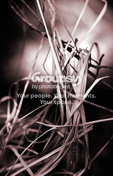
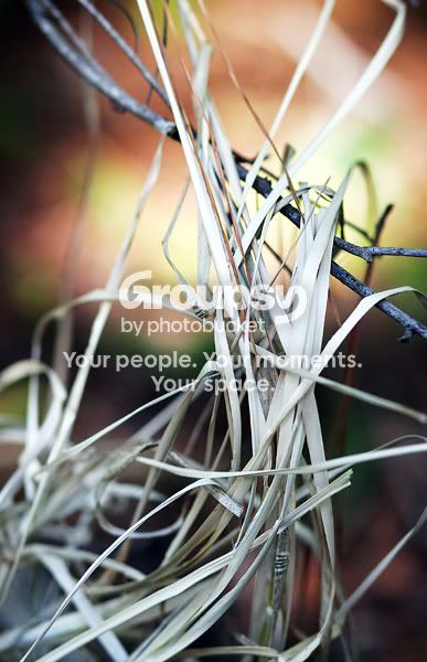
I like each one a little, but i cant decide on one. What do you guys think? This was part of my little 'detail' series. any other critique would be appreciated as well!

info:
85mm
f2.8
1/1600s
ISO 400
-1 stop exposure (i think)

bw:
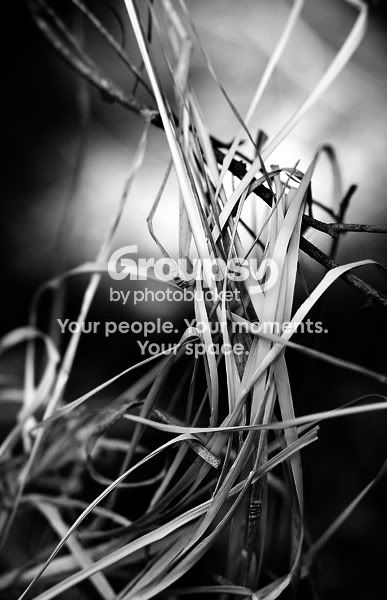
hay-smbw.jpg


sepia:
hay-smsepia.jpg


color:
hay-sm.jpg


thanks for any comments or critique!
 
I like the black and white the best...Im not a fan of sepia :-/
and the background in the color photo is a bit distracting to me...I tend to be more interested in what's going on back there, instead of the subject...
 
B&W or color. I like them both for different reasons. B&W for the same reason marm said. But I like the color since they are interesting colors and is a great example of bokeh.
 
I agree....I like the black and white one the best also. Nice work.
 
I normally wouldn't go for B&W... and I don't in this case either. :lol:

The colour one has a sense of fire about it but I think the gamma is too high so the grass looks a bit flat. With a bit of playing in with curves, I think it could look really hot and vibrant.
 
thanks for the comments guys !

marctwo, it's actually dead grass, so it's more like hay. it was all pretty much one tone, so 'curving' didnt change much (i did use some though).
 
black and white vote here too.
 
I actually prefer the color here, though it might be nice to see the image darkened down a tad. The background is a bit too bright, but I like the soft blur of color.

Second choice would be the B&W.

The sepia looks "off" to me; it's more copper than sepia - at least, on my monitor. ;)
 
i also agree the background is too bright but the b&w seems easier on my eye than the rest. i like your shot.
 
thanks again for the insight!

my monitor might need calibrating, the background doesnt seem that bright, but i see what you're saying. 'sepia' for me is pretty broad. whenever i use a warm tone on an image i call it sepia. basically. :D
 
thebeginning said:
...so 'curving' didnt change much (i did use some though).
Hmm... I did try this myself and found the difference in mood to be quite dramatic - even with only one curve point eg. input: 224 output: 192 (although I normally use 2 curves adjustment layers).
 
I like the color version best.
 

Create an account or login to comment

You must be a member in order to leave a comment

Create account

Create an account on our community. It's easy!

Log in

Already have an account? Log in here.

New Topics

Back
Top Bottom