What's new

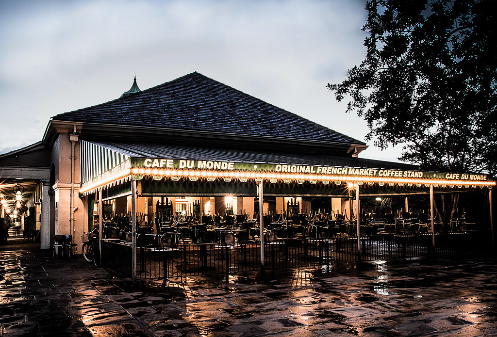
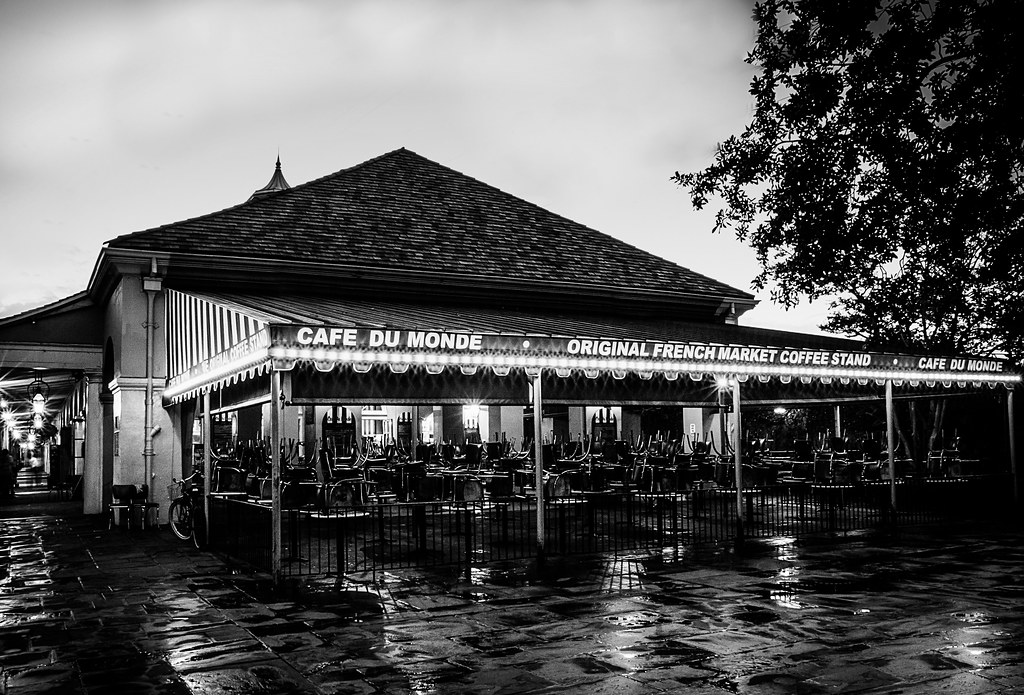
Color or BW? - Final edit for exhibit

sorry, I really don't care for this in BW. For me, a good B&W is just something to sit back, relax and study. This is so busy, it makes my eyes tired. Just my two cents.
 
The BW has a bright sky like it's not night but the restaurant appears it's night time. A little confusing to me. I'd go with the color.
 
I prefer the color rendering, but that said, I think the overly dark upper right hand corner looks heavy-handed; significantly reducing the burn-in on that one corner would go a loooong ways toward making this into a better picture.
 
I pick the color version.

The light quality leaves a lot to be desired.
The white balance of the color image looks odd (orange-ish color cast) because of mixed lighting - daylight/shade and incandescent.
The tonal range of the B&W looks to narrow.

The B&W rendering looks like you just de-saturated the entire image globally rather than editing to adjust the tonal range on a color by color basis, and by using dodge and burn to advantage which Derrel mentioned for the upper right corner of the frame.

Your profile doesn't show an edit preference - My Photos Are OK to Edit or My Photos Are NOT OK to Edit - so it's hard to describe in words how either image could look with a different approach to their editing.
 
It is OK to edit my images. I set it in my profile.
 

Create an account or login to comment

You must be a member in order to leave a comment

Create account

Create an account on our community. It's easy!

Log in

Already have an account? Log in here.

Back
Top Bottom