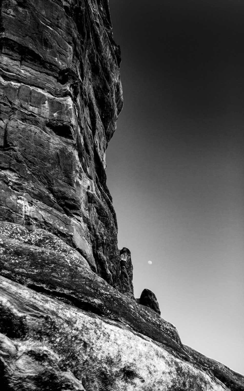
The first looks like it would be nice as a large print, but I think it doesn't work well at this size on screen. It's worth a try as a larger print, although you may be limited in size by the sharpness, as it was hand-held. The leading line through the trees is good and the overall contrast is nice. I might back off on the sky darkening on both of them, but that's personal taste more than anything else. In the second, did you try making the moon a bit lighter to make it stand out more? This could work even with the sky less dark. I'd also make some of the brighter areas in the foreground a little darker and/or crop the bottom a little.

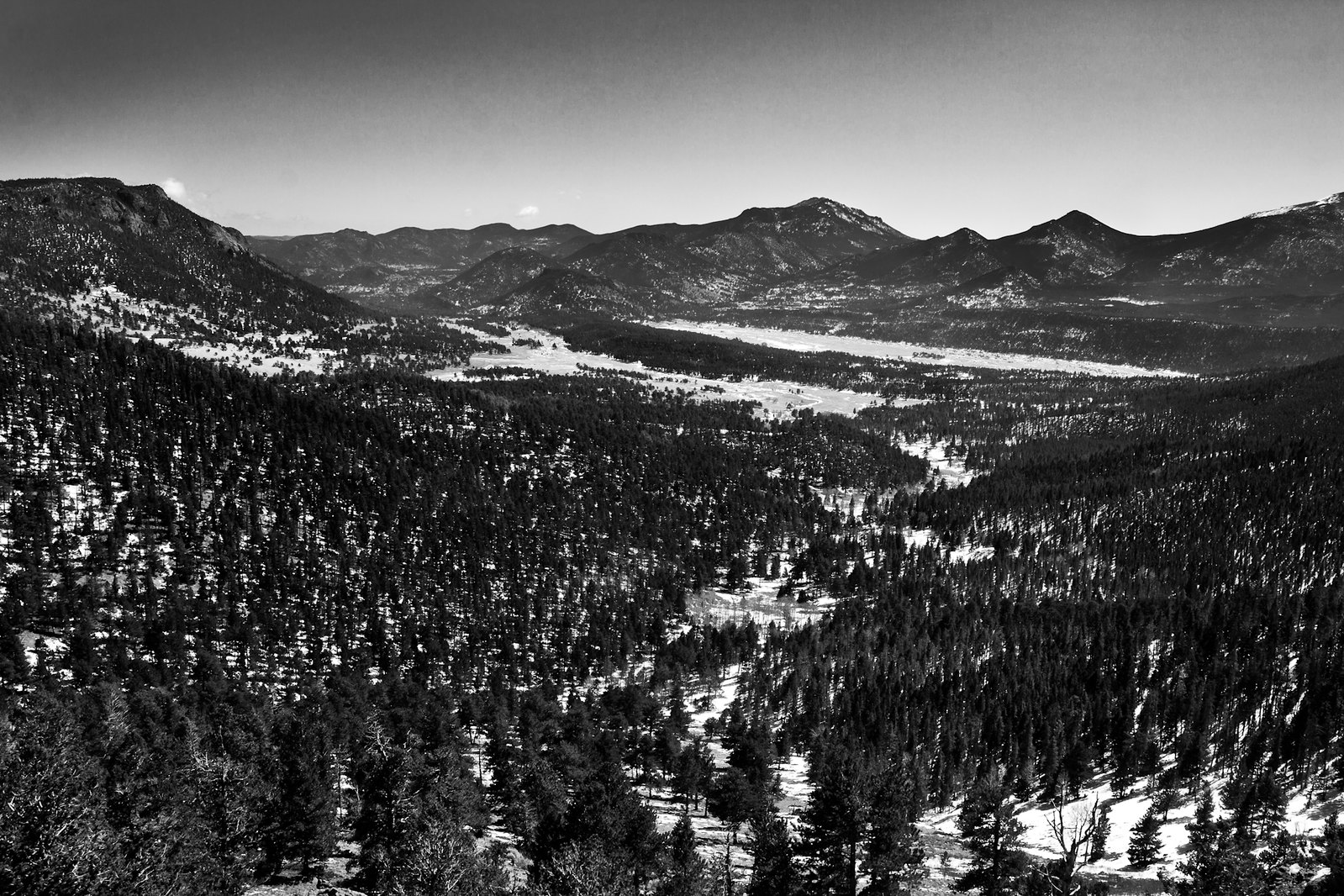


 Do settings need to be adjusted when using an adapted lens?


![[No title]](/data/xfmg/thumbnail/36/36132-5bd4fa365c199003273e0ff128bf42f4.jpg?1734168228)
![[No title]](/data/xfmg/thumbnail/36/36134-64e77d33cc4c68e1253adc2879f24a96.jpg?1734168240)