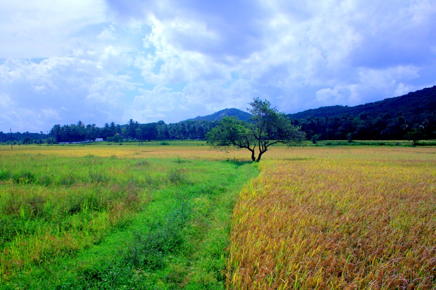
I think the colors are fine the way they are, but my comment is that I actually think this would work better if the tree and the dividing line leading up to it were placed dead center.
I think the colors are fine the way they are, but my comment is that I actually think this would work better if the tree and the dividing line leading up to it were placed dead center.




 thank you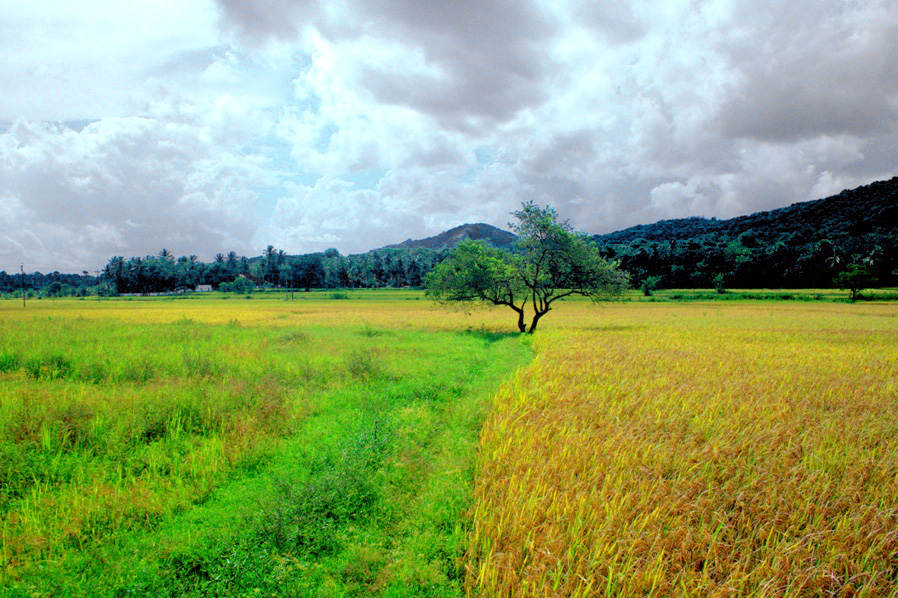






![[No title]](/data/xfmg/thumbnail/37/37640-803bb25a4f46642289fe136733ddfbde.jpg?1734170763)