Coloring An Apple C&C

Chriss

TPF Noob!
Joined
Jan 5, 2010
Messages
325
Reaction score
7
Location
Cincinnati
Can others edit my Photos
Photos OK to edit
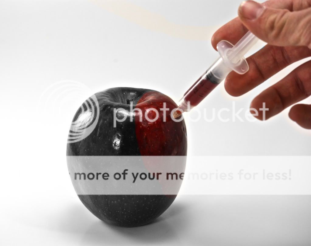
Thoughts on this one? Lit from left, right, top, and front. I know a lot of you dislike selective coloring, but I figured it was appropriate in this shot considering the purpose of the photo is to show a man injecting color into a colorless apple. What do you think?

Exif:
Rebel Xsi
1/250 f/8
100mm

Apple.jpg
 
good diea not so good with the coloring and focus. I wish the whole thing was focused more and sharp. Looks a little soft for my eyes to be honest. I'd also like to see it more bright and vibrant.

5248152676_9052761cf7_z.jpg


ok and one more for the hell of it....

5247548477_8ec7b6dd86_z.jpg
 
Hehehe, I love the first edit you did. Guess I was too lazy to edit. Thank you, that's what I was looking for.
 
Hmm, I like the second edit as well actually... The red curve on the first edit (as long as the original picture) just kind of stops abruptly halfway across the apple. On your second edit, although it's a tad excessive, the red kind of leads into the black, and doesn't really "stop" anywhere. I dunno which one I prefer. Maybe the second. Thank you a lot for the edit.
 
Well, art serves best as a dialogue.
 
For grins and giggles, I'd like to see the hand in color as well.

You know...he who gives the world color should have color as well.

I prefer the original over the edits.
 
For grins and giggles, I'd like to see the hand in color as well.

You know...he who gives the world color should have color as well.

I prefer the original over the edits.

Much appreciated. I'll post one of the hand in color tomorrow.
 
Meh, I had the time so I went ahead and made a quick edit with the hand in color.

ApplewithColoredHand.jpg


There you are. Thanks for you all your comments.

I just noticed that there is a big, yellow streak.... Ignore that until tomorrow, when I can get a better version up..
 
I think that you need to use a softer edge between the color and B&W sections. Other than that I really like it.
 
Ooooh! Nice. (yellow line ignored as requested)

I thought the same as Destin, but I dunno. Judgement call. It depends on the physics in your fantasy land. I also thought about how it would spread, clean and even like in the image, or spotty and irregular. *shrug*

Chriss, I think a nit picky detail, is how perspective would effect the area at the stem indentation. I think the color patch should be disjointed a bit rather than one continuous edge, for added realism.

Thanks for entertaining my request, and hope you experiment more with this idea!

that's what throws the eye off, another good catch..
 

Most reactions

Back
Top