Cool Blue... Comments and Critiques

D-B-J

Been spending a lot of time on here!
Joined
Apr 13, 2010
Messages
9,027
Reaction score
2,175
Can others edit my Photos
Photos OK to edit
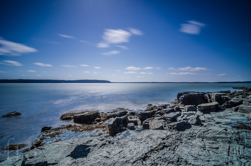
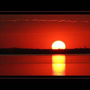
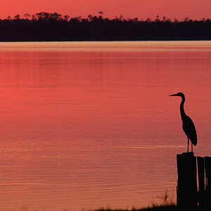
Today has been stressful, and I ran out to grab a few shots when I had a few minutes to breathe. Thoughts?


Cool Blue by f_one_eight, on Flickr

Cheers!
Jake
 
Just saw this come up on Flickr. I like it but it's kind of boring haha. The lack of clouds take away from the motion effect that you achieved with your other scenes.
 
Just saw this come up on Flickr. I like it but it's kind of boring haha. The lack of clouds take away from the motion effect that you achieved with your other scenes.

I agree completely. Just curious if others thought the same.

Jake


Sent from my iPhone using Tapatalk
 
Too short of a focal length to render the scene with any interest. The background just has that "faraway and unimportant" look that many wide-angle scenic shots are cursed with. Shots made with short focal length lenses, like this shot, are often just not that interesting, visually, because everything beyond about 10 feet is TINY...and nothing is really visible to the eye...
 
Too short of a focal length to render the scene with any interest. The background just has that "faraway and unimportant" look that many wide-angle scenic shots are cursed with. Shots made with short focal length lenses, like this shot, are often just not that interesting, visually, because everything beyond about 10 feet is TINY...and nothing is really visible to the eye...

I agree. Not my strongest, by any means. More of a "I'm stressed and need to take a quick break with the half hour of free time I have" shot, haha.

Jake


Sent from my iPhone using Tapatalk
 
Wellll, the day has gotten better! Looks like photography is becoming my escape from it all...

Jake
 
For me there is too much saturation in the sky in both of them. Uneven very dark vignette is distracting to me, but I like the scenes of both.
 
For me there is too much saturation in the sky in both of them. Uneven very dark vignette is distracting to me, but I like the scenes of both.

The awkward vignette is mostly as a result of the sun being slightly off center just out of frame on the top, and left of center a slight bit. Made for some funky shading/vignetting.


Jake


Sent from my iPhone using Tapatalk
 
On the first one, I like how the reeds are leaning in a way that directs me to the center horizon.
 
I don't mind #2. I would have tilted it down to make the sky about 1 third plus the vignetting makes it look a little underexposed.
 
I don't mind #2. I would have tilted it down to make the sky about 1 third plus the vignetting makes it look a little underexposed.

Hmmm, I agree.


Sent from my iPhone using Tapatalk
 
TBH, the first photo is dull, I think you should also try a black and white version of the first one. I think the vignette at the upper corners and the over-saturated sky are harsh on eyes, also the tree is somewhat motion blurred, which shouldn't have been as the other trees are sharp. Should have used a bit longer focal length or cropped the tree at this focal length. The grasses and bushes at the bottom are leading into the photo, but the tree disturbs it that's why.

The second one is much better, but again over saturated sky and vignette. What's that shadow at the bottom of the frame, in the middle, kinda disturbing isn't it?
 
I like them both, looks like a peaceful place to relax. That's how I feel when I go out shooting, stress relieve big time. Even If I come home with no pix, just being out in nature for a few hours is like a little Minnie vacation. I do think it would be better with out vignette.
 
Last edited:
TBH, the first photo is dull, I think you should also try a black and white version of the first one. I think the vignette at the upper corners and the over-saturated sky are harsh on eyes, also the tree is somewhat motion blurred, which shouldn't have been as the other trees are sharp. Should have used a bit longer focal length or cropped the tree at this focal length. The grasses and bushes at the bottom are leading into the photo, but the tree disturbs it that's why.

The second one is much better, but again over saturated sky and vignette. What's that shadow at the bottom of the frame, in the middle, kinda disturbing isn't it?

I agree. The vignette is too heavy, the saturation is a touch overdone, and the scene itself isn't fascinating.

Jake


Sent from my iPhone using Tapatalk
 

Most reactions

New Topics

Back
Top