Cool logo treatment or not so hot?

inTempus

TPF Noob!
Joined
Dec 15, 2008
Messages
3,692
Reaction score
4
Location
Indiana
Can others edit my Photos
Photos OK to edit
I've seen some photogs on the big modeling sites that use this technique for their logos. Of course this is a more stylized version of what they do... usually it's just solid text in a more conventional font.

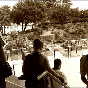
So I thought I would try it with this image for last weekend.

632112509_QWrK4-XL.jpg


Cool?

Bunk?

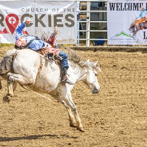
Here's the standard watermark I've been using for comparison.

628824095_q4m6c-XL.jpg
 
I think it looks pretty cool, but not something I would use as a watermark on every image (not sure if that was your plan).
 
I feel like I should add: This makes it look like a cover shot for "In Tempus Magazine" or something. Cool but it seems, to me, like it takes away from the model and image overall. It's too over-powering for general watermark use. I end up looking at your cool logo rather than the image itself :p
 
Yeah, it's not for every shot but I was thinking of trying to do a shot with each set that I could use this treatment on.

This guy does it to all of his shots, but changes the font and style up every time.


That's a link given by Model Mayhem below each image so it's ok that the image appears here. That's why they give the link.
 
i like the idea, but I don't like that I can tell its photoshopped.. theres a couple spots around her right arm where you can see it
 
His is more classy, where as yours looks very 'cheap'. Basically, I like the look of the others because it seems intellectual. Your font and design to me is more 'bad ass' not something you'd see in an actual model shoot.

Remember, the type of modeling pics your work is after, is not the 'bad ass' crowd. It's the wealthy, high class, ritz and glitz people of our society.

I think you are getting extremely good with your model shots. But i'll be honest I think your current logo is really tacky and actually makes them look worse. Also, I really dislike when people add 'photography' to their watermark. I mean, it's obvious this is not "intempus painting".
 
Remember, the type of modeling pics your work is after, is not the 'bad ass' crowd. It's the wealthy, high class, ritz and glitz people of our society.

I find it interesting that you think you know the audience I'm going after. :) I guess you've not seen many of my images.

Here's my MM port:

Where Professional Models Meet Model Photographers - ModelMayhem

I'm not "classy" by any means. My tastes are more towards the darker side. Even the shot above has hints of it in that it's not a "bright" image. Her dress is dark, the bright sunlight is muted.

I think you are getting extremely good with your model shots. But i'll be honest I think your current logo is really tacky and actually makes them look worse. Also, I really dislike when people add 'photography' to their watermark. I mean, it's obvious this is not "intempus painting".
I may play with other fonts, but I don't want an image that's "classy" in the slightest. I want something somewhere between Suicide Girls and Michael Vincent. :)
 
Tharm I really like your work, but that watermark is WAY over the top for my tastes... :D

I see what you're going for, but I think Goontz nailed it. I spent more time looking at the text than the model. That may be because I have seen the shot before, but in the end I do think that it was the first thing I looked at, even perhaps before recognizing the shot.
 
I find it interesting that you think you know the audience I'm going after. :) I guess you've not seen many of my images.

Here's my MM port:

Where Professional Models Meet Model Photographers - ModelMayhem

I've looked at all of those, maybe twice. I truly thought they were more practice, utilizing free "model" work and doing them for free yourself.

but at least I now know that...

I'm not "classy" by any means. My tastes are more towards the darker side.
Well in that case, the logo is perfect! I would possibly add some flames to make it a little more rinky-dink, it will also make it a little bit more sleazy. Especially for that MM and suicide girls style your going for! !


I may play with other fonts, but I don't want an image that's "classy" in the slightest. :)
I would...Like I said, flames, maybe some bevel.
 
Tharm, I think it's too overpowering. I would simplify it. Think Nike, Vogue, Gucci, Gap and all these brands. It's simple yet powerful. Looking at the first draft you presented, it actually doesn't need a model because it is loud as it is. You want your model to compliment your logo and vice-versa.
 
For marketing and ads, I think it's great (if a little loud as Camz noted).

If you start watermarking all of your images like this I will come over there and trash your 1D in retribution. :greenpbl:
 
Simple is always best. Class and elegance always go hand in hand with simple. Simple doesn't mean bare or not conditioned.

Think about it, you'll get what I'm saying. It's a bit difficult to explain over the internet.
 
I like the logo for situations like this where your displaying images on forums and sites but not for my personal collection.

I definitely like #2 better
 

Most reactions

New Topics

Back
Top