JWest09
TPF Noob!
- Joined
- Jan 12, 2009
- Messages
- 16
- Reaction score
- 0
- Location
- Edmond, Oklahoma
- Can others edit my Photos
- Photos OK to edit
critique away!


Follow along with the video below to see how to install our site as a web app on your home screen.

Note: This feature currently requires accessing the site using the built-in Safari browser.
I hate to be the bearer of bad news...but I can tell the lighting sucks, so you should have brought a tripod.
I hate to be the bearer of bad news...but I can tell the lighting sucks, so you should have brought a tripod.
Ummm...no. Tripods and wedding/event photography are usually not a good mix. Can you see yourself setting up a tripod in the middle of the church isle and having to rush to move it out of the way as they are coming down, potentially missing shots, and hitting aunt Gertrude in the head with the legs?
I would skip the tripod for weddings. This is the reason why wedding photographers use top gear and top knowledge... bad lighting. 2.8 and faster lenses, pro camera bodies for high ISO... not a tripod.
As for the images:
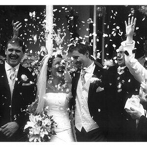
1- I dont mind the tilt in the image, its not too bad. I dont like how its not well exposed though. As pointed out, the groom's tux is totally black and the back of the church ceiling is very white. Not a good mix. Maybe a different angle, cutting out some of the ceiling would work? It also seems blurry where as the groom's face is not in focus. I also dont like where it was cut on their legs.
2- Nice angle here, I like that. Better in the exposure department, but the focus seems to be on the small flowers on the side? My eye was hunting for what is in focus and couldnt land on anything. I would of loved to have the couple in focus here or a foreground focus subject a bit more obvious
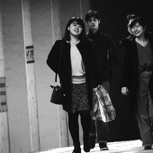
3- Interesting shot. I feel the groom is way too in your face in the image. Back off slightly to make his face less imposing and more interesting. As mentionned, I dont like how they are all facing in different directions, with the second guy also looking at the camera. Odd choice, what were you going for?
4- If this was a pure candid, nice job getting it! If it was posed, then you should of taken more time to not get them smack in the center and maybe get less of the door. Its a nice shot overall though.
I hope you werent paid for this event. It looks like it was good practice for you though
I hate to be the bearer of bad news...but I can tell the lighting sucks, so you should have brought a tripod.
Ummm...no. Tripods and wedding/event photography are usually not a good mix. Can you see yourself setting up a tripod in the middle of the church isle and having to rush to move it out of the way as they are coming down, potentially missing shots, and hitting aunt Gertrude in the head with the legs?
I would skip the tripod for weddings. This is the reason why wedding photographers use top gear and top knowledge... bad lighting. 2.8 and faster lenses, pro camera bodies for high ISO... not a tripod.
As for the images:
1- I dont mind the tilt in the image, its not too bad. I dont like how its not well exposed though. As pointed out, the groom's tux is totally black and the back of the church ceiling is very white. Not a good mix. Maybe a different angle, cutting out some of the ceiling would work? It also seems blurry where as the groom's face is not in focus. I also dont like where it was cut on their legs.
2- Nice angle here, I like that. Better in the exposure department, but the focus seems to be on the small flowers on the side? My eye was hunting for what is in focus and couldnt land on anything. I would of loved to have the couple in focus here or a foreground focus subject a bit more obvious
3- Interesting shot. I feel the groom is way too in your face in the image. Back off slightly to make his face less imposing and more interesting. As mentionned, I dont like how they are all facing in different directions, with the second guy also looking at the camera. Odd choice, what were you going for?
4- If this was a pure candid, nice job getting it! If it was posed, then you should of taken more time to not get them smack in the center and maybe get less of the door. Its a nice shot overall though.
I hope you werent paid for this event. It looks like it was good practice for you though

![[No title]](/data/xfmg/thumbnail/35/35880-9a6926237907ab72b42781d9a09698a6.jpg?1619737209)


![[No title]](/data/xfmg/thumbnail/39/39509-3c2c5856429b4b8ff3cf44cd3b2afa8c.jpg?1619739064)