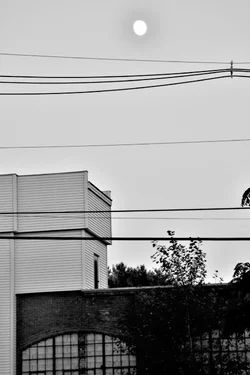
I kinda like the first one. It's very graphic, all these straight lines and on top of it all, a big blown out moon. The only other curved shape is the arch of the window, but even those windows contain the lines of the bars. If anything, I would have cloned out the trees to keep it more 'pure' in terms of the graphic element so the moon would be even more starkly contrasted. I think that's why I don't mind that the moon is blown out - it's in contrast to almost every other element in the frame, so that contrast is just highlighted (no pun intended).




![[No title]](/data/xfmg/thumbnail/40/40286-86401b94de8b01bea8bb4ea154aaea0a.jpg?1734174701)