Creepy Church C&C

kanuski

No longer a newbie, moving up!
Joined
Sep 23, 2012
Messages
212
Reaction score
35
Location
Saskatchewan, Canada
Website
www.flickr.com
Can others edit my Photos
Photos OK to edit
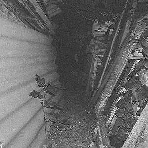
This really was creepy but I would like to go back and try again. What should I do differently? HDR? Any suggestions for PP?
1. $IMG_2301-2.jpg 2.$IMG_2301-3.jpg 3.$IMG_2301.jpg 4.$IMG_2301-4.jpg
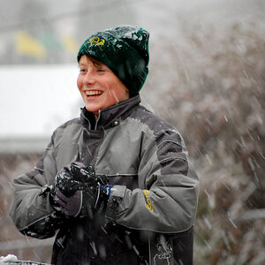
Maybe if I moved to the left the church would move more to the right side of the background?

1/200 sec, f6.3, 21mm, iso 100. One bare strobe and one shot through umbrella.
 
Last edited:
Your photos look excellent to me, I especially like the third one to the right because she stands out just enough to draw attention to her vs having your eyes completely drawn to the church. Personally with my style I would go back there and re shoot the scene at around the same time but I would compose it so that the church is on the right and she is leaning in the fence right in the middle on the left side of the frame and I would be shooting from the front instead of the side but that would be if I shot it with my style.....each photographer has their own style and my style aims for symmetry and balance whereas you may prefer something else.
 
The gate is very distracting. If you go back to take more similar photos I would go through the gate so it won't show in the photos. Either that or change framing and lighting so that the person in the image has a bigger part to play. The white shirt the person is wearing should probably be changed as well.
 
REALLY GOOD concept...it's missing something though...kind of difficult to say what,exactly, would be the best approach. My thought would be to shoot this earlier in the day, with more light on the church, then bring the entire image "down" in post...the girl appears a bit under-lighted...I dunno...yeah, I think maybe changing her shirt to a darker one would help some....the white might be kind of fooling the eye--white advances, and is VERY eye-catching especially in mostly-dark compositions...still, a good idea....that church DOES look very,very creepy!

Maybe have her behind the gate???
 
ooh great location and concept. Id like the girls face to be brighter than her shirt though. Definetly worth shooting a lot more here!
 
Is it abandoned???? OOOOO! LOVE things like that!
I think I definitely like a little bit of definition in the church-more ambient light. I am not so sure about the silhouette part. I'd like to see her perhaps walking along from the church to one side a little or walking toward the church to one side and maybe even turned to look back over her shoulder as if to make sure she's not followed... I could have loads of fun there!! NEED to get my passport and come to your neck of the woods!
 
the concept misses the mark for me. there's no link between your subject and the background. imo the shot is either the creepy church or the girl, together they're just two separate elements that get in the way of each other. I almost want to say that in this case, it's the girl that's in the way. With that pose, gaze/expression, and under lighting the only thing that really interests me is the church, and she's blocking half of it! the fence is certainly not helping either. it's a glaring physical and metaphorical barrier between the two subjects. i think crazy portrait locations work when you're going for all out glamour type shots. beautifully lit/dressed/prepared model in some crazy location. these shots are all about the crazy "look at me" aesthetic, no reason or realism with the location and lighting, just some absurdly interesting mix of elements that gets the viewer's attention. otherwise it just looks more like a touristy, "look i was there" type documentation (which does have it's purpose, just doesn't necessarily make for a cohesive image). the subject is way underlit in #1 and the colors are too painterly, and 2-4 don't really show me anything with the church silhouette, and the desaturation only brings out the brightness of the gate.

my opinion, if you reshoot: go past the gate, and be sure to include the crooked roof cross and detail/color of the weathered walls. that's what pushes the creepiness factor. and really light up your subject both literally and figuratively, make sure she is just as interesting (if not more) than the background.
 
They're all creepy in my opinion. :D
 
I would compose it so that the church is on the right and she is leaning in the fence right in the middle on the left side of the frame and I would be shooting from the front instead of the side but that would be if I shot it with my style.....each photographer has their own style and my style aims for symmetry and balance whereas you may prefer something else.
I agree. Getting the church more to the right would help.
 
The gate is very distracting. If you go back to take more similar photos I would go through the gate so it won't show in the photos. Either that or change framing and lighting so that the person in the image has a bigger part to play. The white shirt the person is wearing should probably be changed as well.
That makes sense too. I have done some shots there without the lighting and the gate looked better, in my opinion.20101111-IMG_7830 | Flickr - Photo Sharing!
It is strange how those "amazing" pictures I took a year or two ago now look really bad.
 
REALLY GOOD concept...it's missing something though...kind of difficult to say what,exactly, would be the best approach. My thought would be to shoot this earlier in the day, with more light on the church, then bring the entire image "down" in post...the girl appears a bit under-lighted...I dunno...yeah, I think maybe changing her shirt to a darker one would help some....the white might be kind of fooling the eye--white advances, and is VERY eye-catching especially in mostly-dark compositions...still, a good idea....that church DOES look very,very creepy!

Maybe have her behind the gate???

Thanks Derrel, I am getting some great ideas here. I knew from the moment we got there that the shirt was going to be a problem.
 
the concept misses the mark for me. there's no link between your subject and the background. imo the shot is either the creepy church or the girl, together they're just two separate elements that get in the way of each other. I almost want to say that in this case, it's the girl that's in the way. With that pose, gaze/expression, and under lighting the only thing that really interests me is the church, and she's blocking half of it! the fence is certainly not helping either. it's a glaring physical and metaphorical barrier between the two subjects. i think crazy portrait locations work when you're going for all out glamour type shots. beautifully lit/dressed/prepared model in some crazy location. these shots are all about the crazy "look at me" aesthetic, no reason or realism with the location and lighting, just some absurdly interesting mix of elements that gets the viewer's attention. otherwise it just looks more like a touristy, "look i was there" type documentation (which does have it's purpose, just doesn't necessarily make for a cohesive image). the subject is way underlit in #1 and the colors are too painterly, and 2-4 don't really show me anything with the church silhouette, and the desaturation only brings out the brightness of the gate.

my opinion, if you reshoot: go past the gate, and be sure to include the crooked roof cross and detail/color of the weathered walls. that's what pushes the creepiness factor. and really light up your subject both literally and figuratively, make sure she is just as interesting (if not more) than the background.
Wow. Thanks. I don't get many helpful comments like this on Flickr. I guess I was really more concerned about the photography than the art.
 
Is it abandoned???? OOOOO! LOVE things like that!
I think I definitely like a little bit of definition in the church-more ambient light. I am not so sure about the silhouette part. I'd like to see her perhaps walking along from the church to one side a little or walking toward the church to one side and maybe even turned to look back over her shoulder as if to make sure she's not followed... I could have loads of fun there!! NEED to get my passport and come to your neck of the woods!
It is a great place to shoot. I like your idea of the drama. I will try to get the model more involved next time.
Abandoned Saskatchewan - a set on Flickr
 

Most reactions

Back
Top