What's new

Critical C&C, please.

theeph

TPF Noob!
Joined
Apr 5, 2012
Messages
66
Reaction score
9
Location
United States
Can others edit my Photos
Photos NOT OK to edit
Give it to me.


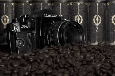
$CKnightTableaux2.webp
 
I'd edit out the word "canon". :-D

Seriously though, what sort of C&C you lookin' for? What are you wanting to show with this image? To me, it's just a camera sitting in some coffee beans. Kinda cool, but I don't get much more out of it than that.
 
Yep...there are focus issues that make it a little awkward. I think would look better "flat"...more depth of field...but it'll still be a camera sitting in coffee beans, though. I can't seem to find the connection between the three elements in this photo.
 
Deep. In beans, anyway.
 
I'd edit out the word "canon". :-D

And what would you put in? Nikon? Don't be ridiculous............
He just meant to take out the logo and leave it there, you want it to look vintage....you son't want to make it look like an advertisement for canon, you want to show that the fact the cam is old
 
I think the burning question on everyone's lips is; Why is the camera in the coffee beans?
 
Beans to this.
 
You cannot make a coffee without processing those coffee bean; you have to patiently work it out
Like wise you cannot click and see the image using an analogue camera-what ever be its brand- you need processing ;) ;) ;)
 
and the books?

so you can't make a picture without processing and reading some books to learn how?

really stretching here.
I'm happier with camera in coffee beans.
 
Meh. Needs more contrast at a minimum.
 
You guys cant make the connection? Canon, Camera, Coffee all start with letter C! Come on!


This post brought you by the letter "C".
 
Interesting surrealist still life.

Subject matter is attention gettingly weird. Light's ok, a little flat maybe, but there's enough Stuff in frame that you maybe don't want the light too exciting, lest the frame become overbusy. Technically it's fine. Focus, color. blah blah. The placement of forms in the frame is appealing, nothing earth shattering but perfectly well done.

For me the main problem is that it is neither surreal enough, not ordinary enough. It's normal enough to cause us to ask 'why is the camera there?' rather than simply allowing us to enjoy the bizarre juxtaposition of elements. It's too surreal to make sense, however. On the one hand, I see the power of walking that line, it makes the viewer a little uncomfortable, it makes us look and look again. On the other hand, we're left without much reward for our effort. Maybe you don't want to reward us, and that's ok, but I assume then you will forgive us for being slightly cranky after looking at your image for a while!

EDIT: I do absolutely love the way the hues and textures flow together. The books (?) in the background and the coffee beans obviously play together, but the textures of the camera tie it to the books, and there's enough color in the lettering on the lens to tie it chromatically to the books and the beans, and the metallic highlights on the camera and the books play well together. As a study of texture, tone, and hue, it's freakin' awesome.

 

Create an account or login to comment

You must be a member in order to leave a comment

Create account

Create an account on our community. It's easy!

Log in

Already have an account? Log in here.

Back
Top Bottom