What's new

Critique my 3 best/3 worst images.

all of them are quite uninteresting...does nothing for me. try using a different focus point.

What would you suggest?
Learn as much as you can about the visual arts and the principles of good design.

Simplicity
Form
Shape
Line
Balance
Color theory
Visual weight
Positive space
Negative space
Movement
Depth
Contrast
Texture
Value
Emphasis
Proportion
Unity
Rhythm
Geometry
Accent
Perspective
Presentation
Framing
 
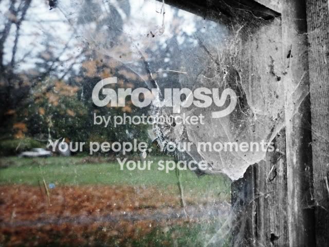
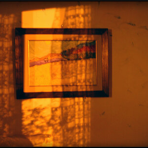
I rather liked the last one too and noticed you don't mind edits to your photos. Here's my play on it. If you'd like me to take it down, lemme know. I know I know... selective color... bleh, but I felt it fitting. :)

window1.jpg
 
I rather liked the last one too and noticed you don't mind edits to your photos. Here's my play on it. If you'd like me to take it down, lemme know. I know I know... selective color... bleh, but I felt it fitting. :)

window1.jpg
I like it a lot.

Did you do that with a mask or something?
 
Yes, I did a lot to it actually. I boosted the levels to bring out the oranges in the leaves. I boosted the contrast on the original image. I did a fairly high b/w conversion and masked it and then painted on the color layer and then lowered the saturation of the color some and left the rest b/w. Then merged layers and did a final contrast tweak.
 
Oh, and I did a radial zoom vingette at like 30% opacity.
 
yeah im lovin #6 too especially the edit ....try getting some more photos of it with different perspectives you know someone already said it but i'll say it again keep experimenting :)
 
Awesome.

Ill try to get some variations of it tomorrow afternoon.

There are a few different holes in the window so that gives me some more opportunities.

What angles/focuses do you think I should try?

BTW I am somewhat limited as far as focus stuff because its a p+s camera
 
First of all, it hasn't even been 12 hours since your last reply, is it really necessary to bump?

None of these pictures are doing anything for me at all. The only one that's even close to interesting is the lighting on the 1st picture. What were you going for in #5? I realize you're limited using a point and shoot, but there's a difference between using and point and shoot and point and shoot-esque style shooting. What do you find interesting about this picture? Just curious.
 
all of them are quite uninteresting...does nothing for me. try using a different focus point.

What would you suggest?
Learn as much as you can about the visual arts and the principles of good design.

Simplicity
Form
Shape
Line
Balance
Color theory
Visual weight
Positive space
Negative space
Movement
Depth
Contrast
Texture
Value
Emphasis
Proportion
Unity
Rhythm
Geometry
Accent
Perspective
Presentation
Framing

I like think of it as S.F.S.L.B.C.V.P.N.M.D.C.T.V.E.P.U.R.G.A.P.P.F. Just helps me remember the list in a pinch.


p!nK
 
Awesome.

Ill try to get some variations of it tomorrow afternoon.

There are a few different holes in the window so that gives me some more opportunities.

What angles/focuses do you think I should try?

BTW I am somewhat limited as far as focus stuff because its a p+s camera

depends on the scene, no? as far as the one in the pic, try head on if you don't mind seeing yourself in the reflection and try to get the whole window in the frame since its a p+s take it start pointing it at the window in some random directions and see what you like, lol.
Do think what makes that orientation\perspective\thing that made it seem attractive. :)
 
I took some retakes and these are what I came up with:
1.png

5.png


I also added some new pictures:


2.png

3.png

4.png
 
Okay, so your first retake of the hole in the window is better. But still not great. Experiment with different angles, it appears you just put the camera in macro mode or zoomed in on the glass, but you were still probably standing in the same spot.

The second retake also suffers from the fact that there's still nothing interesting to look at. It's paint. Underexposed, and out of focus paint.

The seagull doesn't take up nearly enough of the frame. It's also spaced towards the top of the photo as well.

Whatever the subject is in this photo, it's underexposed. Perhaps if you moved to your right, you could have blocked out that bright white area with the subject, and been able to expose for the foreground a bit better.

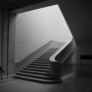
This one is semi interesting, but could benefit from a retake. Try photographing something dead on. So that your camera is parallel to the wall. Often times you can find interesting lines leading to the edge of the frame, which generally makes for pleasing images.

 
Last edited:

Create an account or login to comment

You must be a member in order to leave a comment

Create account

Create an account on our community. It's easy!

Log in

Already have an account? Log in here.

Back
Top Bottom