I think the first one would look better from a different angle, maybe showing some more of the wall, make sure you follow the rule of thirds for a different angle, and try to get a bit more of the blue faucet head in focus.
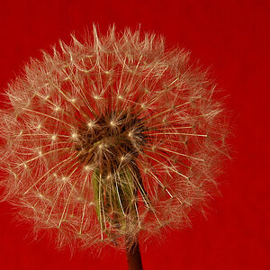
As for the flower, it seems a but out of focus, and the background is kind of bland.
Just my opinions =p