I do this type of thing as well as photography and video/television.
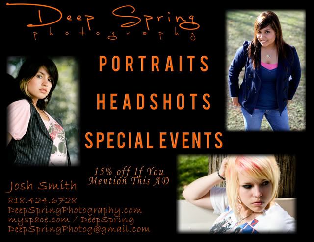
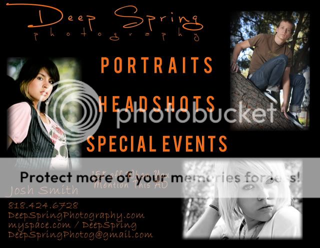
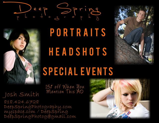
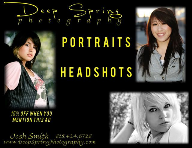
You are emphasizing portraits, head shots and special events in your text but not in your photos. Your portraits and headshots have a problem considering the top of the head is cut off in two of them and the hair blends into the background with the other. The pose of the guy with the jeans that are a little too dark visually is awkward particularly with his arm between his legs. All colour is better than black and white but the eyes must be visible and bright which is not true in the lower colour shot.
You need an excellent shot of a special event to go with your text.
There are guidelines for graphic and printing as well and use of fonts is an important item. The fonts have to be similar in style and readable from the distance that most people would read a poster. This is certainly not the case with your advertisement.
I would suggest that you look at some books on printing and page design that deal with such things as image, communication, style and present ideas on how to match what you want to communicate with your ad and the appropriate fonts and location and style of images that work.
Your general idea is OK but page design is a completely new area of technique, expertise and composition.
skieur




![[No title]](/data/xfmg/thumbnail/34/34061-e097813b3719866d07ff3e78e8119ffa.jpg?1734164477)


![[No title]](/data/xfmg/thumbnail/40/40285-2ce5915035c220ccb3485030863b62d0.jpg?1734174700)
![[No title]](/data/xfmg/thumbnail/40/40287-4f839095000f74d779b90ed75df9dc62.jpg?1734174702)
