Critique? Opinions?

madisonofriel

TPF Noob!
Joined
Jun 11, 2014
Messages
121
Reaction score
12
Location
Georgia
Can others edit my Photos
Photos NOT OK to edit
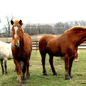
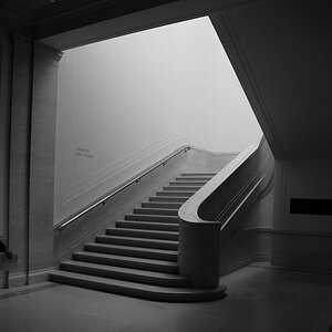
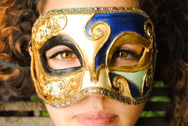
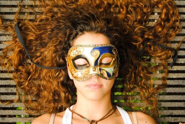
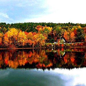
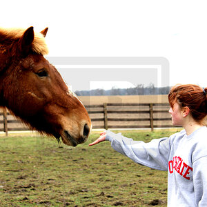
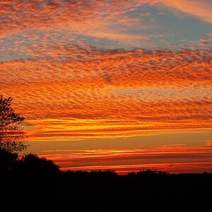
Do you ever take photos you just aren't sure about? These are some... I am just on the fence about whether I like them or not and would like some outside opinions.

Ps : I would not usually have chosen the masquerade masks, my friends brought them to the shoot and I didn't think woods and the masks would be a good mix?
 

Attachments

  • $DSC_0566-2.jpg
    $DSC_0566-2.jpg
    323.1 KB · Views: 96
  • $DSC_0590.jpg
    $DSC_0590.jpg
    388.6 KB · Views: 54
  • $DSC_0462.jpg
    $DSC_0462.jpg
    108.7 KB · Views: 70
  • $DSC_0382.jpg
    $DSC_0382.jpg
    160.1 KB · Views: 57
I'd think about how you're using space - the first one makes me feel like I want to step back because she's so cropped down. The second one of her might have been better without the hair cropped quite so much across the top and her necklace cut off. I'd also have thought about how to arrange the strings attached to the mask, maybe tucked out of the way would have looked better since they create lines cutting across her hair. Might need some adjustment, seems a little bright in the lighter tan area, but I like the masks against the wood, something unique.

The one of the glass seems fun but there's a lot of foreground, it might have been better to bring the viewer in to the subject more. I like the idea of the one of the antique watch but might have liked it better not centered over the walkway below, or that might have worked without so much background (it's a lot of green!). You seem to be on the right track just need to make some adjustments.

It's good I think when you can see in your work what's good and what could still use some improvement. Sometimes I find if I leave something and come back another day I'll often see right away what needs to be fixed and then can figure out what to do.

Yeah The reason I they are cropped like that is because usually I try to shoot some close and some far away so when I have to crop it for instagram, I don't have to cut any out, i just zoom in.
The close up I do wish I hadn't been so close but we were being hurried to move on and it was all I could get in focus lol. And I was on a bridge so it was impossible to get any further away :) Thanks for the tips!
 
Many times I'll edit a quirky frame that intrigued me not knowing if it works or not. Usually those are my best frames. :D
 
They suffer from focus issues.

Your first one the focus is on the mask just in front of the eyes with people you need to focus in the eyes.

Second one focus is ok.

Third and forth ones the focus was also missed.
 

Most reactions

Back
Top