Critique please?

Emmy7

TPF Noob!
Joined
Jul 9, 2012
Messages
23
Reaction score
4
Can others edit my Photos
Photos NOT OK to edit
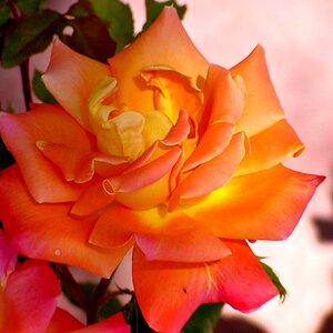
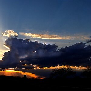
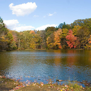
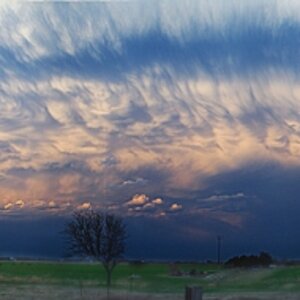
I'm really not a professional but I hope to pursue photography as a career in my future... with lots of practice of course. Would you please help me and critique a few of my photos? I will post some better pictures later
Thank you!


1. $image-1413780365.jpg


2. $image-2481522346.jpg


3. $image-4155552032.jpg


4. $image-3291014967.jpg


5. $image-1701474033.jpg


6. $image-2167668630.jpg


7. $image-1514356335.jpg


8. $image-540525843.jpg
 
P.s sorry if I posted this in the wrong section!
 
Come on! I need some help ;)
 
# 1 & 4 are both underexposed and overexposed, but I believe I can see what you were trying to do. Unfortunately im not that good to be able to critique how to fix it. Though, I know others will be.

#2 Isn't too bad, but could use some contrast and/or level adjustment. And I would clone out that little bit of twig sticking out from the leaf.

#3 is a nice shot, but underexposed and the crop feels a little too tight on top and to the left side. Also would clone the bottom left black.

#4 same could be said for it as #2 minus the twig comment.

#5 I like as is.

#6 Is nice, but feels a little too much like a snapshot to me, I don't know why.

#7 Looks flat to my eyes. Maybe because of the green on green colors with it.


All are good shots though. Could just use a little bit of adjustments either with the shots themselves or with PP.
 
Thank you! I just got photoshop so I'm still playing around and haven't had time to try it out with these photos. You were a big help!
 
You're welcome. My suggestions are just that, suggestions. Take them or leave them as I am just a beginner myself and nowhere near as good as that majority of the members here.

A tip when photographing animals close like that (or of peoples faces), put the focus on the eyes. If you look at your photo of the dog, you can see the focus is on the nose as the eyes look a little soft in compassion. :)
 
Cut down on the number of images in a post ... too many reduces the responses.

Girl and curtains ... as it is not a silhouette, you should add some light to illuminate her from the front ... don't like hair covering eyes.
#5 could use a crop
The others seem kind of snap-shotty.
 
Good tip! Thank you!
 
Ali can understand how they look snapshotty because it was before I got my Canon Rebel. These pics are from when I had a Canon Pwershot G11 so I couldn't really get any better quality. Thank you for your advice!
 
Cut down on the number of images in a post ... too many reduces the responses.

Very true, but at least she did space and number them. Very rare for a new member to do.

A tip Emmy, usually 5 is the max pictures you want to put in one post. 3 is best, but no more than 5.
 
Ali can understand how they look snapshotty because it was before I got my Canon Rebel. These pics are from when I had a Canon Pwershot G11 so I couldn't really get any better quality. Thank you for your advice!

I know all too well how that is. I cant afford a DSLR + lenses yet and currently use a Canon SX130IS. Although limiting, I do as best I can with it and hopefully when the time comes that I do get a DSLR, it will just make me that much better for working with a DSLR.
 
Thanks! This is my first post and I wasn't really sure. To be honest, I think I got kind of excited and crammed them all into one post. You are teaching me so much :)
 
I like #1 and #8 quite well. There's a very ethereal quality to them, with the white filmy drapes and the almost but not quite obscured figure. There's a mysterious feel to them, and a lot of visual drama. If you were trying for portraits, you failed utterly, but if you were trying for a dreamy mysterious image, they're both quite good ;)

#2, #4 and #7 (the various plant life studies) all suffer from extremely flat lighting. It looks like it was overcast? This solves the sort of lighting problems you experienced shooting #1 and #8, but at the expense of making very flat images. The compositions are not striking or amazing, but they show something of an eye for form and balance. With better light, these would be fine photographs.

#6, the baby, has the same flat light. Kids are pretty great as subjects, but the flat lighting does this one no favors, and he (?) isn't doing anything terrible interesting. Staring gape-mouthed isn't as attractive or interesting as manifesting some emotion or another.

#3 The dog is pretty good, see how the light makes things more interesting? The focus should be on the eyes, as suggested earlier.

#5 The reflection is quite nice. Good shapes and lines and things going on there, some nice visual pop from the black reflected bars, the shiny water, and the warm bright spot on the pavement. This is where your grasp of form and composition gets room to breathe unhampered by bad light ;)
 
Gear shouldn't determine whether things look snapshotty, by the way. Better gear is nice and all, but fine work can be done with almost anything.
 

Most reactions

Back
Top