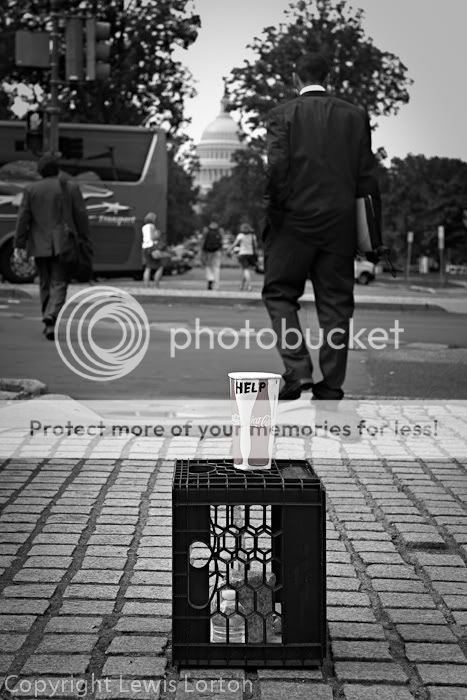
It's a photo? No chit? And, it's a photo showing the center of US federal government power..and a guy who looks suspiciously like the current US President,paired with a beggar's cup asking for handouts. And you're trying to solicit comments on this "photo" and at the same time trying to determine what we're allowed to see in the photo and talk about in this "photo". And you're claiming it's not a political statement.
Wow, Lew, you're being kind of a dick about this entire thing. With a PR-D in front of it...
I just didn't want this to degenerate into a political argument about government.and politics.
It is possible to say whether something is interesting, good, bad, effective about a picture without discussing the politics; we can look at pictures of Napoleon without discussing French politics of the time.
You can look at pictures of the British Royal Wedding without going into overheat about whether the monarchy is an outdated, money-sucking institution, you can listen to Mahler without discussing the fact that he was a Nazi.
Hell, you can look at a pictures of quintuplets without arguing about whether multiple births are bad for the family economics.
And, of course, pictures of religious iconography posted here (crosses, churches, etc) don't erupt into vigorous discussions about religion.
All I am asking is that pictures be treated as pictures and not excuses for people to rant about their own favorite topic.
(As I remember, Derrel, you took me to task for making an anti-gun comment on a thread devoted to pictures of guns. I figure if gun worship is a sacrosanct topic then a political image ought to be treated with the same courtesy.)
I think the composition and focus are effective - the people across the street are somewhat oof and using too wide an aperture would risk losing the capitol dome. A few quibbles about the processing: (1) the sky is unevenly and sort of obviously darkened; a lighter touch would look better and the sky could still be darker than the cup, which is the object, I assume, (2) the woman's blouse across the street on the left is a little too bright and should be darkened somewhat, (3) the darker tones are a little lacking in detail, especially on the figure closest to the foreground, who doesn't stand out from the background as much as he should, and (4) I'm not sure about the residual color on the cup - it's too little to have much effect, so more or none would work better for me.
I do like that it's subdued - you see a lot of selective coloring where it's way over the top. I personally just think that the cup stands out enough on it's own without using selective coloring.
I do like that it's subdued - you see a lot of selective coloring where it's way over the top. I personally just think that the cup stands out enough on it's own without using selective coloring.
In a routine bw conversion the deeply saturated red turns effectively to black and hides the lettering so the red in the conversion is over exposed to lighten it and allow the letters to stand out.

![[No title]](/data/xfmg/thumbnail/33/33493-f055dbbe7f00f271d3959dd3a6482165.jpg?1619736004)
![[No title]](/data/xfmg/thumbnail/39/39225-99d579cd498f8f152a288d7e8e7ad2a4.jpg?1619738926)

![[No title]](/data/xfmg/thumbnail/35/35878-753a9d58c095f0e1aaa96d03c025f6ce.jpg?1619737205)