What's new

Dancer Portfolio - C&C

tirediron

Watch the Birdy!
Staff member
Joined
Jul 8, 2005
Messages
45,747
Reaction score
14,806
Location
Victoria, BC
Can others edit my Photos
Photos OK to edit
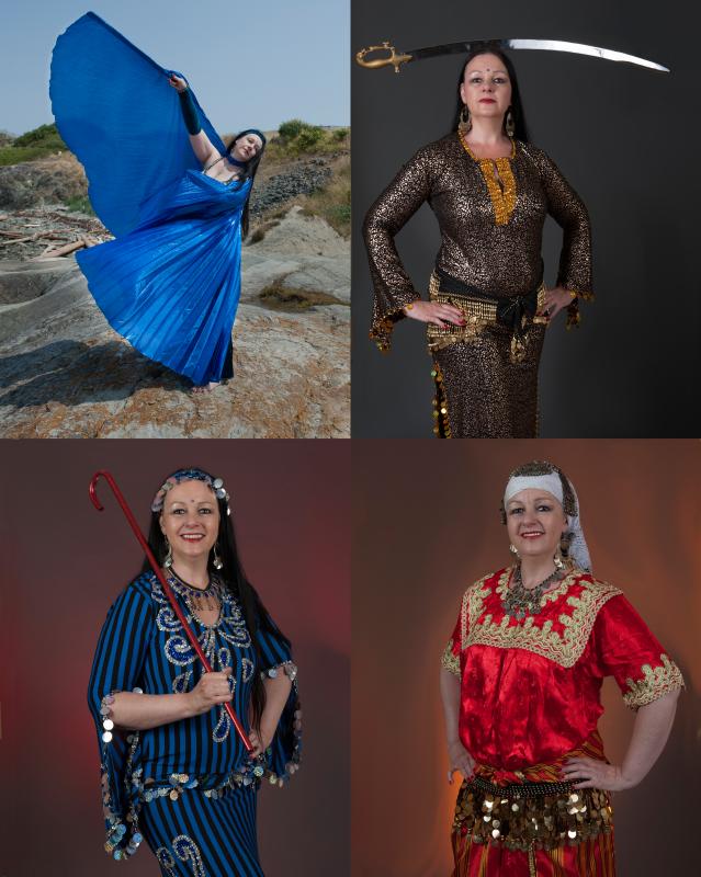
One of my current projects: A portfolio shoot for a local Oriental dancer. It's not 100% finished, but I would appreciate any thoughts on the group (and yes, I know there are more than four images, but it's more about the whole package), however any comments/thoughts on indvidual images would be appreciated as well.

Thanks!

~John
1. ('Z' Sheet)
Z_Sheet_Susan.jpg


2.
Susan%20(5).jpg


3.
Susan%20(6).jpg


4.
Susan%20(8).jpg


5.
Susan%20(9).jpg


6.
Susan%20(11).jpg


7.
Susan%20(10).jpg
 
Last edited:
I think the studio shots are quite nice. The skin might be slightly gray in 6 and 7, and the light looks a little weak in 6, and perhaps 7 as well.

The outdoor shots seem to suffer a bit from the busy background and all those bushes, trails, rocks and wood. The horizon seems tilted in 3, and in both it cuts through the dancer's head. I like the way the blue costume contrasts with the natural scene, and the sense of action is very real and engaging. Also, could you have dropped the ISO from 400 to 100, kept the shutter speed, but opened up the lens a bit (maybe to f/4) for a more narrow DOF focused on her face? Or leave the aperture alone, drop the shutter speed, and get some blurring in the wing movement.
 
  • Thread Starter 🔹
  • Moderator 🛠️
  • #3
D'ohhhhhh... HOW could I have missed that horizon thing?????? Thanks Jaemie. I'll have to send those to the bit-bucket. I was so busy concentrating on the wings and making sure I got good positions for them, that I totally neglected the basics. DoF and focus were a huge challenge for for those shots and I discussed the idea of static vs. "moving" poses and since the costume and what she's doing in it is the primary purpose (vice say a model's portfolio where it's all about her face) we went with this methodology. The colour/exposure on the studio shots looked good on my monitor, but I'm sending them out for a test-print, so I'll know this evening if who was right!
 
Ya, the horizon stuck out for me as well...and overall, the outdoor shots just don't seem to have enough punch or pop. I'm sure you (and she) were doing your best to get the motion/position of the wings, and you did that well, but the rest is still missing something. My first thought is that it could have been better if the ambient had been underexposed a stop or two and then you could use off camera flash to light her up. This would help to de-emphasize the background and make it look 'better', but if your lighting is dramatic, I think that would would well.

On the topic of lighting, I think the studio shots could stand to take it up a notch. Your ratios are pretty flat, 1:2 and maybe 1:3 or 1:4 in #4. That does typically work for portraits etc, but I think in this case, you could push that and use a darker ratio. You could also use more dramatic light positions. When I see her costumes, I imagine that part of her appeal, part of her personality maybe, is to have an air of mystery. In that sense, leaving parts of her in dark shadow might be a better fit. Also, I think that pushing the post processing might not be a bad thing either...just to give the images more 'magic' and 'mystery'.

That's my two cents anyway.
 
Last edited:
  • Thread Starter 🔹
  • Moderator 🛠️
  • #5
Thanks Mike!! The more I look at it, the more I think we're going to have to redo those outdoor shots. Now that I have the Innovatrix' I can actually get some better light on her.
 

Most reactions

Back
Top Bottom