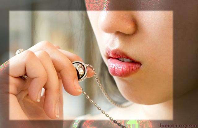
Darling, I Live For Love ~ Amanda Andrea

JohnKokWithAdSLR

TPF Noob!
Joined
Feb 18, 2011
Messages
47
Reaction score
0
Can others edit my Photos
Photos OK to edit
This is Amanda, she has what people describe as cherry lips =)

#1
IMG_4881.jpg


#2
IMG_4690.jpg


#3
IMG_4818.jpg


#4
IMG_4633.jpg
#5
IMG_4672.jpg


Constructive C & C welcome

Sorry about the small pictures, got bigger ones here


Artistically Scientific Side of Things

As an artist, my work is about expressing a person’s character using impressions generated from photos and words and piecing them together to form a bigger picture.

Rather than on a per-picture basis, kindly consider my work through an overall point of view.

The full length of my experimental work can be found here

I would be grateful for any feedback at all as they are valuable for my experiment’s progress. Thank you ;-)
 
Experimental Concept

My artwork is about combining all of the impressions from of all of the photos of the model. In this set I have more than 30 photos, all displayed in a specific format arranged to simulate the layout of a Triptych (Triptych - Wikipedia, the free encyclopedia) but modified to for website publish

Other words you must consider all 50 of these photos plus the words in my article about the model for it to work. Its sort of like a macro scale kind of thing.

My experiment is about being able to accurately express a person using this means.


Approach

I capture my subjects exactly as they are despite what she says about herself and what she does in the pictures

I minimize my influence and bias in the subject by providing minimal direction and art guidance, hence minimizing influence contamination.

Everything in the photos, everything in each word and sentence belongs to the subject and none of mine.

All of this raw data is completely up to the audience to process and interpret to their heart’s content =D

Telling me your interpretation will definitely help me a lot ! So please do =)

As for the background and place i choose, this sort of captures an element of fate to my work. Its like it is fate that we have to shoot at this place at this particular moment ( i hope i am making sense )
 
I'll give you some quick feedback...

#1. I really like the composition of this photo. It's tight, it's interesting, it's eye catching. Watch your exposure as you are riding that fine line of nearly being overexposed and almost loosing some skin detail. I would also probably clean up some of those stray hairs in the background. I personally would probably drop the overall exposure 1/3-ish of a stop.

#2. It's soft. Looks like you slightly missed the focus. The composition does not do much for me and with her head being intersected by the painting(or whatever it is) in the background, it only detracts from it further. Her hand position is also not flattering to her face.

#3. Hand position is better, as is the compostion but again, the background is distracting... Particularly the blue and yellow "Aldo" sign. My eyes immediately were drawn to it instead of her. Luckily, that is something easy to clone out. I'd remove it giving you a much better shot. Her pose, in combination with the weird crop, just does not work. Is she leaning on something??

#4. Not really sure what's going on here. Is she opening a present? White balance seems a bit off and cropping her foot in the middle is a big no-no. She has something in the background growing out of her head making it look like she has a monstrous cartoon ear. Not really sure what you were going for in this photo...

#5. Again, the Aldo sign... Very distracting and my eyes jumped straight to it. Photo is a bit washed out and lacking any contrast and the crop and position of her body is just not appealing. A good rule of thumb is to never crop at any joints(fingers, elbows, ankles, etc) or midpoints of the hands\feet. What or where is she looking? I get the impression she just got cut off by some rude person while trying to walk in the door and is giving them the stink eye, judging by her expression.

Overall, not bad... I'd say, work on your composition and background selection a little more and I think it would dramatically improve your photos. #1 is very good though! :thumbup:
 
Last edited:
to me only pic #1 appeals to me... the model's pose in #2,4, and 5 really isn't flattering at all

in #3 i don't like how you cut almost half of her arm out of the frame. it makes it look like it's some other person's hand
 
She looks like she is probably very pretty, but you didnt really bring it out. The only photo which actually shows her face is #3, but its an awkward pose.
 
I looked at your site and thought most of them were quite nice, just missing a tiny bit on the final details. One big thing that jumped out was the picture of the foot with the red toenails - and the nail polish was very poorly done. If you focus on a point, make that point perfect.

Re: the pictures here. I don't think 4 and 5 are successful. In 4 the package hides her face and body and her stockings are almost completely black and thus merge together.
In 5 her profile is not so attractive from this angle, she is turned so far away that we can't really see her face and so her chest is about all there is to concentrate on.

I do like 1,2 & 3. They are coherent in that the girl doesn't engage the lens but is intent on something else and so is interesting to look at.
IMO, 1, although tight, needs to be tighter to make the interesting part occupy more of the image, to get that object of interest off dead center. and to get rid of some of the emty face at the top and right.

#2 is nicely framed with the bars of color balancing off her looking out of the frame. I would consider removing that cord (?)

I have mixed feelings about #3 especially the effect of the bright yellow sign. It is sort of empty, yet not dreamy. It is the weakest of teh first 3, IMO.

img4881edit.jpg
 
V
E
R
T
I
C
A
L
S
?
?
?

lol

I'll give you some quick feedback...

#1. I really like the composition of this photo. It's tight, it's interesting, it's eye catching. Watch your exposure as you are riding that fine line of nearly being overexposed and almost loosing some skin detail. I would also probably clean up some of those stray hairs in the background. I personally would probably drop the overall exposure 1/3-ish of a stop.

#2. It's soft. Looks like you slightly missed the focus. The composition does not do much for me and with her head being intersected by the painting(or whatever it is) in the background, it only detracts from it further. Her hand position is also not flattering to her face.

#3. Hand position is better, as is the compostion but again, the background is distracting... Particularly the blue and yellow "Aldo" sign. My eyes immediately were drawn to it instead of her. Luckily, that is something easy to clone out. I'd remove it giving you a much better shot. Her pose, in combination with the weird crop, just does not work. Is she leaning on something??

#4. Not really sure what's going on here. Is she opening a present? White balance seems a bit off and cropping her foot in the middle is a big no-no. She has something in the background growing out of her head making it look like she has a monstrous cartoon ear. Not really sure what you were going for in this photo...

#5. Again, the Aldo sign... Very distracting and my eyes jumped straight to it. Photo is a bit washed out and lacking any contrast and the crop and position of her body is just not appealing. A good rule of thumb is to never crop at any joints(fingers, elbows, ankles, etc) or midpoints of the hands\feet. What or where is she looking? I get the impression she just got cut off by some rude person while trying to walk in the door and is giving them the stink eye, judging by her expression.

Overall, not bad... I'd say, work on your composition and background selection a little more and I think it would dramatically improve your photos. #1 is very good though! :thumbup:

Thank you very much for your points =)

to me only pic #1 appeals to me... the model's pose in #2,4, and 5 really isn't flattering at all

in #3 i don't like how you cut almost half of her arm out of the frame. it makes it look like it's some other person's hand

thank you, I will work on them =)

She looks like she is probably very pretty, but you didnt really bring it out. The only photo which actually shows her face is #3, but its an awkward pose.

=( ok I will work harder

I looked at your site and thought most of them were quite nice, just missing a tiny bit on the final details. One big thing that jumped out was the picture of the foot with the red toenails - and the nail polish was very poorly done. If you focus on a point, make that point perfect.

Re: the pictures here. I don't think 4 and 5 are successful. In 4 the package hides her face and body and her stockings are almost completely black and thus merge together.
In 5 her profile is not so attractive from this angle, she is turned so far away that we can't really see her face and so her chest is about all there is to concentrate on.

I do like 1,2 & 3. They are coherent in that the girl doesn't engage the lens but is intent on something else and so is interesting to look at.
IMO, 1, although tight, needs to be tighter to make the interesting part occupy more of the image, to get that object of interest off dead center. and to get rid of some of the emty face at the top and right.

#2 is nicely framed with the bars of color balancing off her looking out of the frame. I would consider removing that cord (?)

I have mixed feelings about #3 especially the effect of the bright yellow sign. It is sort of empty, yet not dreamy. It is the weakest of teh first 3, IMO.

img4881edit.jpg

Indeed, I have since cleaned up the toe =(

Yeh, my fav pic for the series is the first photo, and yes, a tighter crop will definitely give a better effect =)

You are spot on about #3, it is weak =/

I put #4 & #5 as supporting impressions for #1 - #3

Thank you very much for your pov, I will work harder
 

Most reactions

New Topics

Back
Top