sactown024
No longer a newbie, moving up!
- Joined
- Jul 30, 2012
- Messages
- 658
- Reaction score
- 29
- Location
- New Hampshire
- Can others edit my Photos
- Photos OK to edit
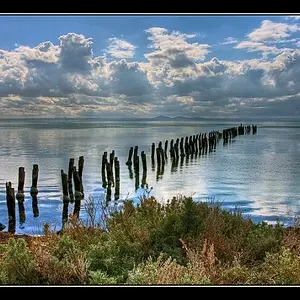
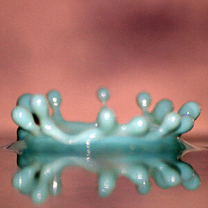
just wanted to get an opinion on other photographers about this look, Everyone on facebook loves it but that doesnt say much.
Not as sharp as I want it to be, its only a 2000px image but I hsot it at like 1/40th by mistake

Not as sharp as I want it to be, its only a 2000px image but I hsot it at like 1/40th by mistake