What's new

Dead End 2012 photoshoot

HowlingWolf

TPF Noob!
Joined
Jan 1, 2012
Messages
79
Reaction score
5
Location
Madera, CA
Can others edit my Photos
Photos NOT OK to edit
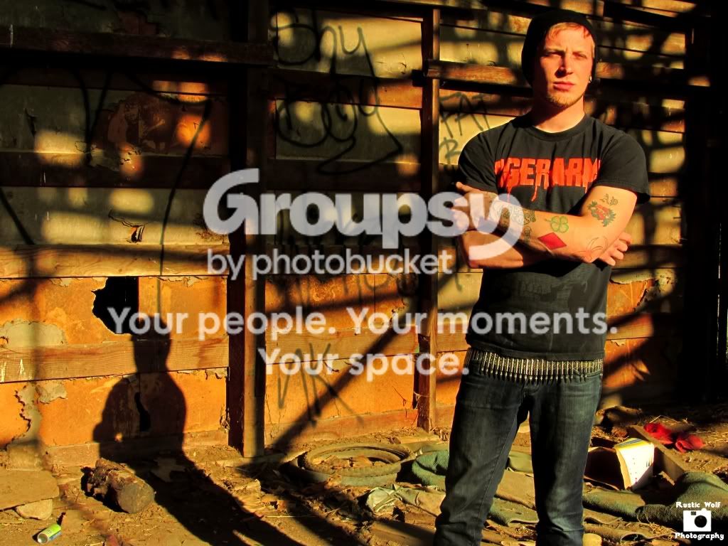
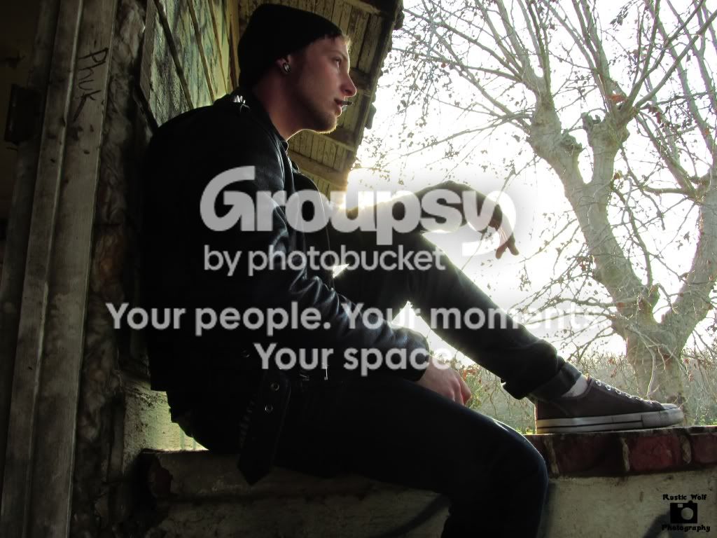
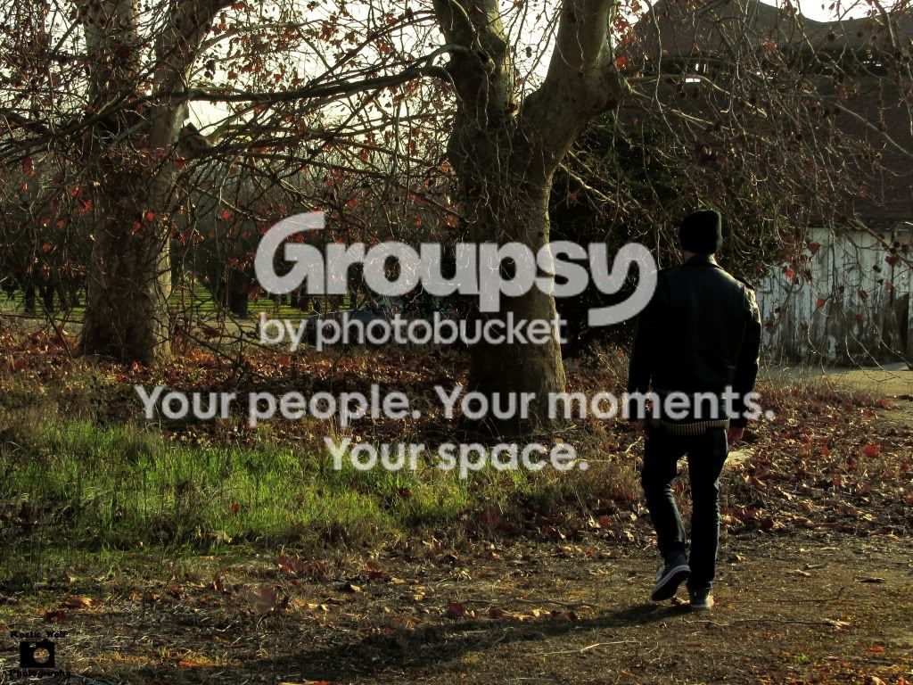
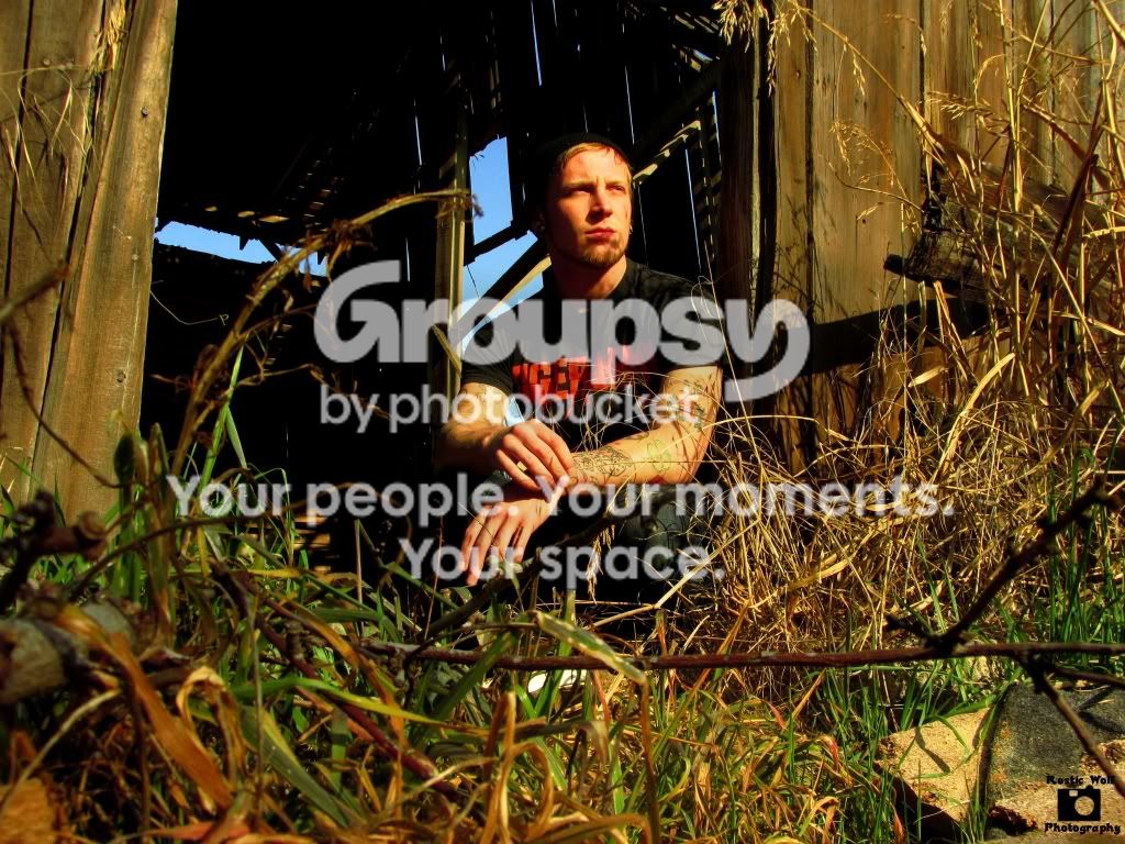
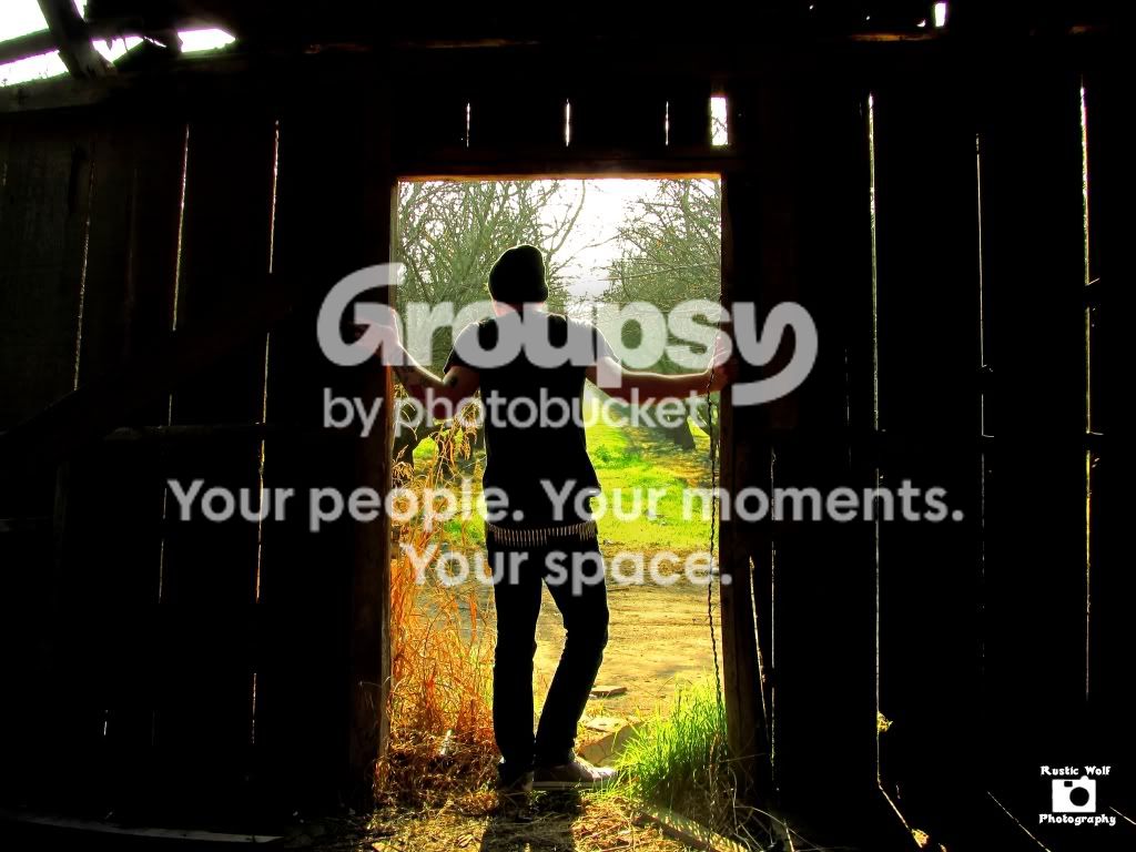
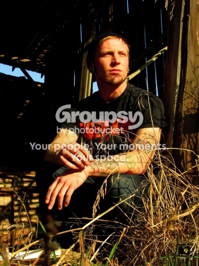
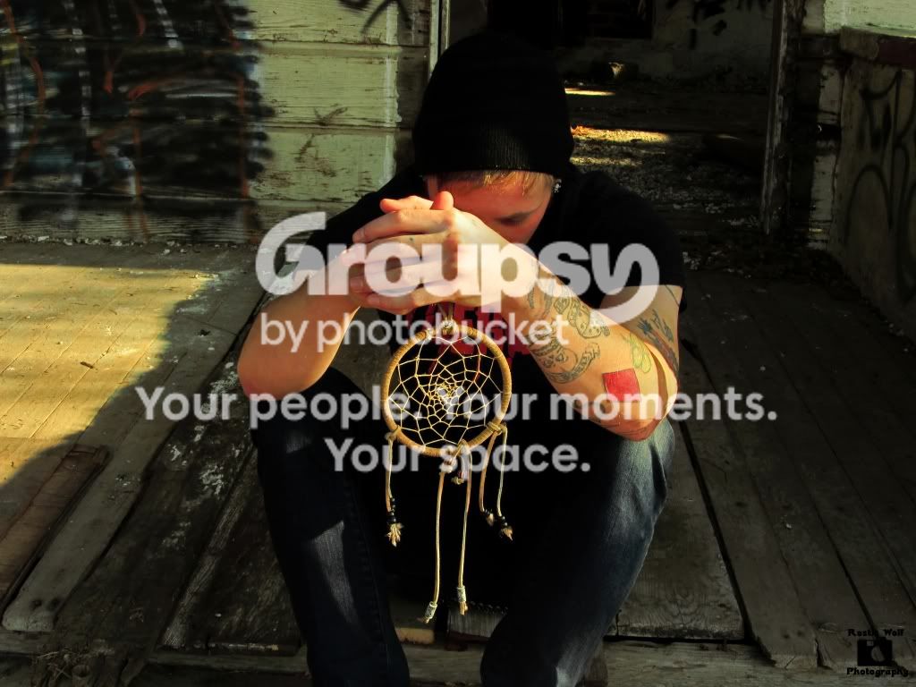
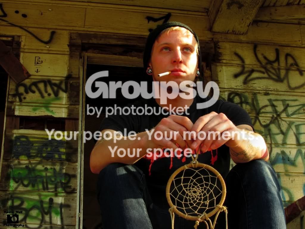
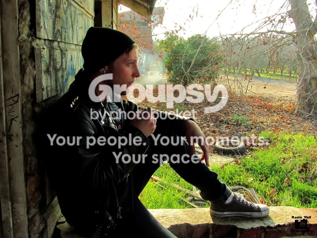
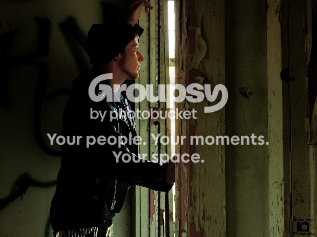
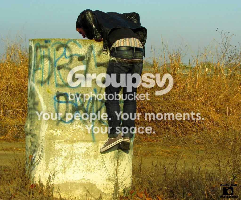
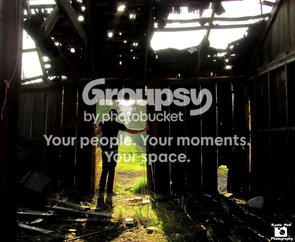
(Oopsy doopsy, I meant Dead End 2012) There are a total of 13 in the set, I wasn't gonna upload all of them but, why not. This was my first shoot, the backstory to this is the model is trying scouring for ways to survive shortly after the whole "world ending" in 2012 deal. I have another shoot tomorrow so any constructive criticism is welcomed :). (although I should mention that I don't have any dark intentions for tomorrows shoot, I'm working with an ex fiance of mine so, not sure what I could get out of her without a slap in the face lol) Note: a couple of these look much better in larger view, especially the one with the red graffiti.

#1
IMG_0956.jpg


#2
IMG_0972.jpg


#3
IMG_0982.jpg


#4
IMG_1017.jpg


#5
IMG_0966.jpg


#6
IMG_0958.jpg


#7
IMG_0965.jpg


#8
IMG_0976.jpg


#9
IMG_0979.jpg


#10
IMG_0981.jpg


#11
IMG_0992.jpg


#12
IMG_1009.jpg


#13
IMG_1014.jpg
 
For #1, 3, & 6 I think the contrast is a little too high in my opinion. Rather than that i think ur photos are very nice! I like the atmosphere, and my favorite picture is #1!! Super cool house!!
 
Thank you :) #3 was a pain, I love the color to it, but couldn't what I completely wanted from it. We had some beers at the house later that night with candles, I couldn't see anything, I loved it.
 
Your white balance seems really off. The yellow hues are causing lots of detail and sharpness to be lost. What was this for?
 
Almost all of these are begging for at least a little fill-light, and, as noted some serious WB issues. Interesting arrangement of compositions and poses.
 
You should have posted the first image alone, because that is an outstanding composition.....

Regards :D
 
MMkay I'll pay closer attention to the white balance, it wasn't really intentional I set it before I left my house and didn't think to mess with it when I was out there.
 
Almost all of these are begging for at least a little fill-light, and, as noted some serious WB issues. Interesting arrangement of compositions and poses.

and kicking and screaming
 
Yeah I get it captain

<3 redundancy by the way, 'cause you never know when someone is too much of an idiot to neglect fixing the messes he messed in the first place, and too arrogant to take advice from their peers and instead focusing on ignoring them all together even though he asked for CONSTRUCTIVE criticism. But I suppose if you are an absolute moron, then a fairly cocky and somewhat almighty attitude might be necessary, even if it can't be taken seriously. Internetz iz silly says meme cat.

I'm sorry I just find it really irritating and rude when people get that silly french artist attitude and gotta be a bit condescending to state what has already been made obvious 'cause maybe they didn't get there first or think they are super duper awesomesauce, when really they just come off as trash trying to seem funny and cool. It's like high school, only less realistic.
 
Last edited:
The post apocalyptic story you're going for doesn't translate in the photos for me. Looks more like promo shots for a band to me. I figured this guy was the lead singer of a band called Dead End until I went back up & read the description. Admittedly, I shouldn't be too lazy to read forum posts...but your pictures should tell the story you intend for them to tell, and my laziness has uncovered a flaw here.

From a technical aspect, the white balance is off...being so warm & vibrant might contribute to the reason I feel like it's a rock press pack instead of an end of days shoot. Maybe try desaturating & using a cooler white balance?

Composition is good across the board, my favs are 1 & 11.

If you tweaked the levels in post to get this look, you might try a little less...a lot of detail is lost in the blacks, you could preserve the detail & still have the strong black look by balancing your levels better.

Tact when responding to criticism on an internet forum could use some improvement...the fill light guys are right, and the 2nd guy who said it was nowhere near as out of line saying so as you seem to think.

Overall they're cool shots & I hope you post what you come up with after shooting your ex. :)
 
I'll be sure to remember to correct it my next shoot, I have one coming up next weekend. Idk if it was because there was so much going on or because we were all focused on getting through it so we could get some beer (ahh Reunions) but I'm glad it was pointed out it was the one thing I didn't think about.
 
The post apocalyptic story you're going for doesn't translate in the photos for me. Looks more like promo shots for a band to me. I figured this guy was the lead singer of a band called Dead End until I went back up & read the description. Admittedly, I shouldn't be too lazy to read forum posts...but your pictures should tell the story you intend for them to tell, and my laziness has uncovered a flaw here.

From a technical aspect, the white balance is off...being so warm & vibrant might contribute to the reason I feel like it's a rock press pack instead of an end of days shoot. Maybe try desaturating & using a cooler white balance?

Composition is good across the board, my favs are 1 & 11.

If you tweaked the levels in post to get this look, you might try a little less...a lot of detail is lost in the blacks, you could preserve the detail & still have the strong black look by balancing your levels better.

Tact when responding to criticism on an internet forum could use some improvement...the fill light guys are right, and the 2nd guy who said it was nowhere near as out of line saying so as you seem to think.

Overall they're cool shots & I hope you post what you come up with after shooting your ex. :)

I don't disagree with them at all, and it's welcomed. It was just the "kicking and screaming" comment that irritated me.

I did up the contrast in post edit by about five on average though I think I went a little far with a couple of them, but for the ones that have a lot of black like number one, I couldn't stand the somewhat visible lines in the wood it felt too distracting and grey. I've also been experimenting with hue intensity in post-edit but I'm thinking I should stop that and just do as I normally would. Post-editing is really new for me though with this camera and I just started learning how to use it in manual mode after shooting the moon a week or so ago. So again it's welcomed, if I was over reacting, I'll do that from time to time, I have my reasons, but don't think too much of it I still take everything seriously.
 

Create an account or login to comment

You must be a member in order to leave a comment

Create account

Create an account on our community. It's easy!

Log in

Already have an account? Log in here.

Back
Top Bottom