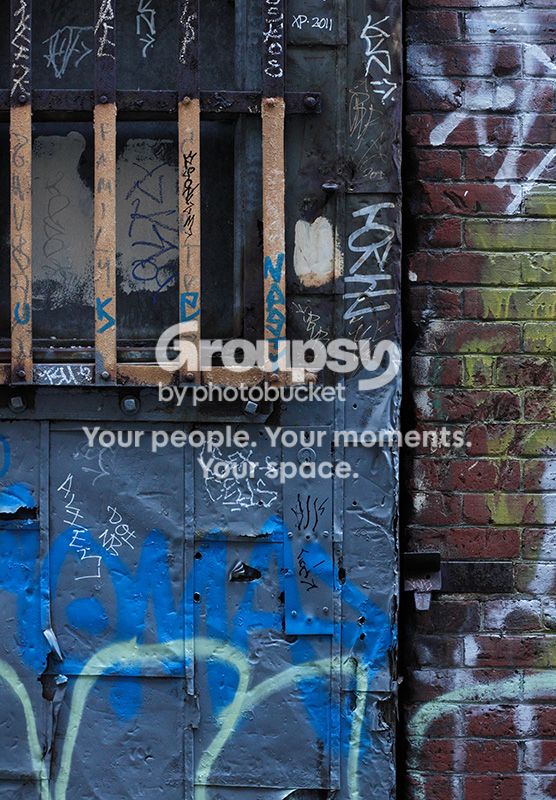
I assume you are attracted by all the different colors and scrawls
There is nice color, sharpness, etc but I don't know what part of this you are wanting me to look at or why.
I agree with Lew. However, the focusing becomes somewhat easier when you view the photo on black. Still, some crafty dodging/burning might benefit the image.
(Also, this feels a bit on the cold side in terms of WB. If this was your choice, just disregard.)
I assume you are attracted by all the different colors and scrawls
There is nice color, sharpness, etc but I don't know what part of this you are wanting me to look at or why.
Lew, I don't have a plan for what viewers should look at. I will attempt to explain what drew me to make this, but that might not be what anyone else wants to look at, if in fact they want to look at any of it. I like the juxtaposition of three different textures that are also different colors: the bricks, the smooth blue metal of the door and the rough yellowish metal bars. These areas are in a roughly circular composition with some of the bigger, brighter graffiti framing them. Some of the little details also interested me, like the tears in the metal door and the blue graffiti on a blue door. This is all probably meaningless to anyone else. In many instances I have felt drawn to the images of others for completely different reasons than those they stated as their intent.
Federico - the WB is indeed bluish because this was taken in a dark alley on an overcast day, so the light was very blue, and it seemed to me to suit the image so I didn't change it. Thanks for the suggestion of viewing on black - I may add a black border to this. I'm curious about what you would dodge or burn.
I assume you are attracted by all the different colors and scrawls
There is nice color, sharpness, etc but I don't know what part of this you are wanting me to look at or why.
I assume you are attracted by all the different colors and scrawls
There is nice color, sharpness, etc but I don't know what part of this you are wanting me to look at or why.
After I made a serious attempt to address your comment, all you chose to do was to quote me out of context and make a wisecrack. Seems pointless to me.
yes, you're right and I apologize.
But that lack of focus is exactly what I thought about when I saw it first.
There are lots of things to look at but they are unrelated and the image is incoherent.
It is possible to have a complex image with a great many things to see but an unrelated selection of different centers makes no visual statement about anything.
If this was mine, I'd probably explore the possibility of making the top-left quarter a tad brighter than the rest of the image, by brightening that quarter or by darkening the rest probably the latter, otherwise a combination of both.
Why is it so difficult to produce a good photograph without a strong visual center, and a strong heirarchy of "what is important" when it is apparently, if not easy, at least possible in other visual arts? (This is a serious question, and one I do not know the answer to, and one which I would dearly like to know the answer to)




![[No title]](/data/xfmg/thumbnail/41/41932-53eeba896d5bf8f132e52d5277f94ce2.jpg?1734176288)

![[No title]](/data/xfmg/thumbnail/42/42267-2fff585000110a96fd9ac3ff09cceb95.jpg?1734176660)