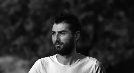
As lit the picture seems to be about the shirt. That's the most brightly lit object, and it draws the eye away from the face which blends into the background. A more neutral tone shirt would have been nice.
I would maybe have added a little fill from behind on the dark side to lift the back of the head away from the black background. Either that or throw a little light onto the background itself. Time allowing, I might have taken four or five different versions with variations on the lighting. The contrast can be nice to emphasize strength, but I would have liked to see more separation between the background tones. If you have RAW and are using something like Lightbox maybe you can turn up the brightness on the background color so that the back of the head shows a little bit of silhouette effect.
I'm pretty new at digital, so take my advice with a grain of salt.




![[No title]](/data/xfmg/thumbnail/42/42351-b976e32171d0405397bf5237bc4b902e.jpg?1734176880)


![[No title]](/data/xfmg/thumbnail/33/33338-4ae29c5eff506820d8b986c033234764.jpg?1734163228)
![[No title]](/data/xfmg/thumbnail/41/41897-ea48d59eea1540d700b6e9051bce38da.jpg?1734176250)